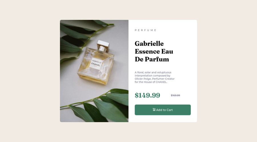
My edited solution with other users advices for Product Card Component


Design comparison

Solution retrospective
I improved my original solution with some users advices (I am an absolute begginer in this). If there´s still anything you would like to tel me about the project to make it better, you are welcome.
Community feedback
- @correlucasPosted about 2 years ago
👾Hello Mario Alberto, Congratulations on completing this challenge!
Nice solution and nice code! I can see that you paid a lot of attention to your code/design. If you don’t mind I’ve some tips for you:
1,THE PICTURE TAG is a shortcut to deal with the multiple images in this challenge. So you can use the
<picture>tag instead of importing this as an<img>or using a div withbackground-image. Use it to place the images and make the change between mobile and desktop, instead of using adivorimgand set the change in the css withdisplay: nonewith the tag picture is more practical and easy. Note that for SEO / search engine reasons isn’t a better practice import this product image with CSS since this will make it harder to the image. Manage both images inside the<picture>tag and use the html to code to set when the images should change setting the devicemax-widthdepending of the device desktop + mobile.Check the link for the official documentation for
<picture>in W3 SCHOOLS:https://www.w3schools.com/tags/tag_picture.asp2.You’ve used
pxas the unit for sizes but the problem with pixels is that its not optimized for multiple devices and screens. So a good fit its to useremoremthat have a better performance and make your site more accessible between different screen sizes and devices.REMandEMdoes not just apply to font size, but to all sizes as well.✌️ I hope this helps you and happy coding!
Marked as helpful0 - @elaineleungPosted about 2 years ago
Hi Mario, welcome to Frontend Mentor, and you did great in completing your first challenge! 😊
About the text elements and their separation, I'm guessing you're referring to the spacing between the text elements. I had a look at your CSS, and I can see that you're using
margin: 0andpadding: 0on thebodyandhtmlselector. It's a good start, but it won't cover all the elements, so what you need is to include that in the star selector as a reset rule, and another thing I'll add as a reset here is for theimg, so try including these at the top:* { box-sizing: border-box; margin: 0; padding: 0; } img { max-width: 100%; display: block; }Once you reset the margins so that the browser won't use its default margins, you can add your own
margin-topormargin-bottomto help put some spacing between the text elements.Some other comments I have here:
-
I'm viewing your site on my laptop and the top and bottom parts are a bit cut off. Try adding a bit of margin around
mainso that there's some spacing (trymargin: 1.5remto start). Also, try removing theheight: 100%fromhtmlandbody, and add insteadmin-height: 100vhto the body only where it's got flexbox. -
For the
container, you can try a max-width of 600px instead to get it looking closer to the design's width. -
I see that you're used
articlefor the image and text containers. Usingarticlefor the image is giving you a warning in the HTML validation part of your report because there are no headings. Anyway,articleis a good choice, and I might use it for the entire card but not each side of the card (which I'd probably usedivfor instead). -
For the
PERFUMElabel, instead of spacing it yourself and changing it to uppercase manually, try usingtext-transform: uppercaseandletter-spacing: 1px(you can experiment with the value!)
That's all for now, and I really think this was a great start for you. Hope to see more solutions, and enjoy your time here! 😊
Marked as helpful0@mcarpegnaPosted about 2 years ago@elaineleung Hi Elaine. I tryed all of of them and the project has really improved and I learnd some more usefull content. Ty for your time and help!
1 -
- @rezi-rezikoPosted about 2 years ago
hello, great job. keep going.
for text <p>, u can use css element line-height.
Marked as helpful0@mcarpegnaPosted about 2 years ago@rezi-reziko I tried but is not what i was looking for. Maybe I can't make me understand. I want to have the text better acomodated, like in the in the example, where words are better separated for ocuping better the space, and so are de lines. Anyway I learnd from your advice. Ty for your time and help!
0


Please log in to post a comment
Log in with GitHub
Join our Discord community
Join thousands of Frontend Mentor community members taking the challenges, sharing resources, helping each other, and chatting about all things front-end!
Join our Discord