Design comparison
Solution retrospective
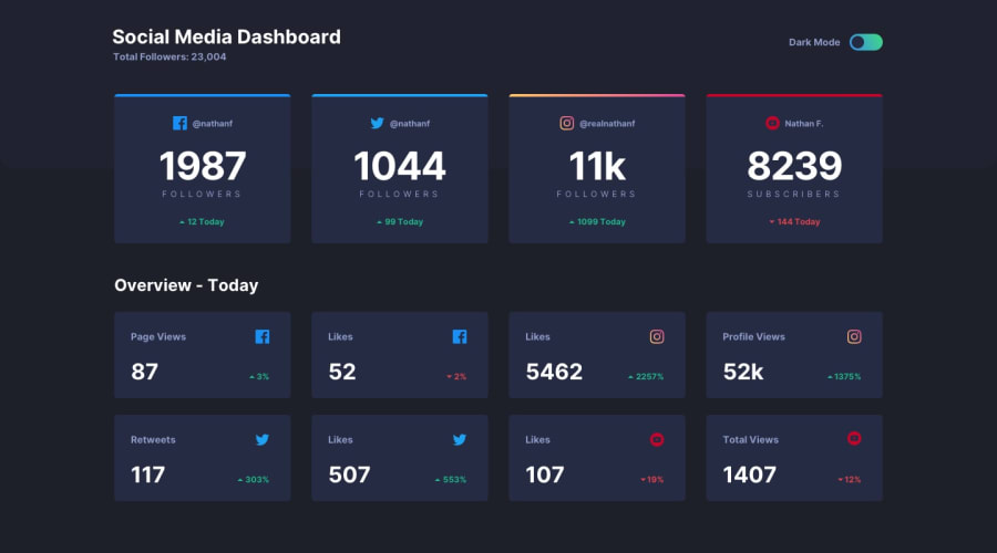
Although I have no noticeable difficulty completing this challenge but there's a part I find confusing. The number of "Youtube subcribers" in the first container is supposed to be red. I tried .card-footer p:not(:last-child) {color: var(--lime-green);} to set the color of the three <p> except for the last one. I'm surprising it didn't work so I had to manually add inline style to the last <p>. If you have any ideas or suggestions, please let me know!
Other than that I'm quite satisfied with the result. This is also the first time I work with dark/light mode switching and it's very interesting.
Community feedback
- @nakoyawilsonPosted almost 3 years ago
You can try adding your youtube class to the selector to specifically target the youtube paragraph instead of using inline styling:
.youtube .card-footer p { color: var(--bright-red); }0@pqhung3007Posted almost 3 years ago@nakoyawilson Thank for the suggestion, Nakoya.
0
Please log in to post a comment
Log in with GitHubJoin our Discord community
Join thousands of Frontend Mentor community members taking the challenges, sharing resources, helping each other, and chatting about all things front-end!
Join our Discord
