

Design comparison

Solution retrospective
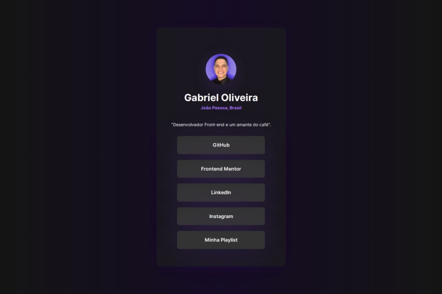
I was very happy to implement one of the palettes I like most, which is purple. I always like a purple, with a grayish-black. What I would do differently next time would be to make the site responsive. In my studies, I haven't reached this part yet.
What challenges did you encounter, and how did you overcome them?Definitely center everything on the screen. I'm finding it difficult, but I know this is happening because I haven't studied this content yet.
What specific areas of your project would you like help with?I would be grateful if you could explain a little about the centralization of content on the page, I believe that each person has a different teaching style, this helps a lot.
Please log in to post a comment
Log in with GitHubCommunity feedback
No feedback yet. Be the first to give feedback on Gabriel Oliveira's solution.
Join our Discord community
Join thousands of Frontend Mentor community members taking the challenges, sharing resources, helping each other, and chatting about all things front-end!
Join our Discord