Design comparison
SolutionDesign
Solution retrospective
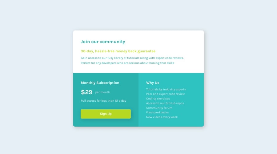
This is the first solution that I send to Frontend Mentor. I have discovered this site recently. I am a newbie in frontend development but I've loved to do it :) I guess this solution is going to appear strange because it has some duplications. Maybe I should have used LESS, so classes can refer to other classes. I am a complete newbie, and I know people do that, but I didn't fell comfortable in using more than one class in the HTML elements and overriding here and there. I think it makes it harder to find where things come from when looking at the CSS.
Community feedback
Please log in to post a comment
Log in with GitHubJoin our Discord community
Join thousands of Frontend Mentor community members taking the challenges, sharing resources, helping each other, and chatting about all things front-end!
Join our Discord
