Design comparison
Solution retrospective
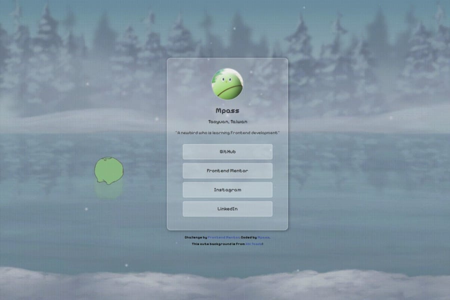
I finally completed something that doesn't fully adhere to the design file; it's entirely my creation. I'm so happy that I can create "MY" own work, and I will strive to create more and more things like this
What challenges did you encounter, and how did you overcome them?At the beginning of this practice, I focused solely on following the design patterns provided by my mentor. However, I felt a desire to do something more interesting, so I decided to incorporate some personal elements into the practice. I'm really pleased with the outcome and how it turned out.
What specific areas of your project would you like help with?If anyone can give that I can add to this profile practise, I will really appreciate that!
Community feedback
Please log in to post a comment
Log in with GitHubJoin our Discord community
Join thousands of Frontend Mentor community members taking the challenges, sharing resources, helping each other, and chatting about all things front-end!
Join our Discord
