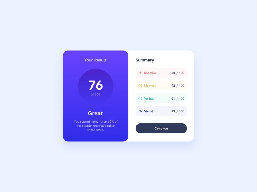
Design comparison
Solution retrospective
Dear All,
Here is my 2nd, i.e. second project ever created and I am open to all kinds of suggestions and criticisim. Honestly, the task was much harder than I thought it would be and even though the result seems okay at first sight, the detailes feel a little bit messy and I don't know how to be more organised in my coding. I guess my main concerns were the following:
1.) I'm not sure about how to name the HTML classes. I was trying to follow some kind of pattern, but the whole thing just ended up rather clumsy. 2.) By the end, I felt like I had a whole lot of random things in CSS, I'm absolutely sure I could not follow the DRY concept, how could I have been more effective? What are the key elements I should pay attention to? 3.) This is my very first attempt of making the project responsive, but I think it is kind of messed up as the image collapses way before 370px width. What did I do wrong? 4.) I really would like to deal with the JSON part and I also know the JavaScript for that, I just don't know how to START! Any hints maybe?
Thank you in advance for checking it out,
Wishing us all fun practicing,
Dalma
Community feedback
- @Amanmawar17Posted over 1 year ago
Hey, You replicate the design really well but it's a bit small, I'll suggest that you try to use the max-width property for your outer divs. and add some padding. Second, while you using media with a max size of screen 375px in line 191 of your CSS file in the GitHub repository change it to min size as it becomes very operational and easy. Classes in your HTML file look OK what you can do to improve it is that you can avoid multiple span tags from the summary section.
Marked as helpful0 - P@LowkeyCoyotePosted over 1 year ago
Hello NBD !
Congratulations !
Great project, the design looks really good!
I'll try to answer some of your questions :)
1 The class names must be explicit, and not ambiguous. You can also limit the use of classes by using css selectors. For example in your code, the h1 element has a class. Whereas you could do without it by selecting it directly. h1{ font-size:..}
3 There is this effect between 370px width (your breakpoint) and 480px, since the width of the card ( The element with the .project classe ) is fixed at 480px on Desktop. One way to remedy this would be to use a higher breakpoint, 500px for example.
Also, don't forget the alternative text for images, for accessibility reasons
I hope you found my post useful
Good Coding :)
Marked as helpful0@bdal90Posted over 1 year agoHello @LowkeyCoyote,
Thak you very much! I was thinking about using css selectors only, but throughout my self-studies, I learnt that it's best to have classes. Maybe that's more useful practice in bigger project, not in tiny ones like this one...
0
Please log in to post a comment
Log in with GitHubJoin our Discord community
Join thousands of Frontend Mentor community members taking the challenges, sharing resources, helping each other, and chatting about all things front-end!
Join our Discord
