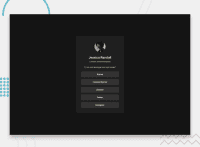
Design comparison
Community feedback
- @AdrianoEscarabotePosted 7 days ago
Hi Govardhan V Prakashmurthy, how’s everything? I think your project turned out great! However, I have some feedback that I think might be useful:
Using Flexbox or Grid on the
bodyto center elements ensures a more responsive and adaptive layout, fitting different screen sizes seamlessly. It avoids manual calculations and constant adjustments needed withmargin,padding, or absolute positioning. These techniques provide more consistent alignment and simplify the code.flexbox:
body {
    display: flex;
    justify-content: center;
    align-items:  center;
    min-height: 100vh;
}
grid:
body {
    display: grid;
    place-content: center;
    min-height: 100vh;
}
The rest is amazing.
I hope this is helpful. 👍
Marked as helpful0@cgeguizabalPosted 7 days agoQuestion, that's considering I have one element, but if I have a complete layout, can I still use flex-box or grid into the body?@AdrianoEscarabote
0
Please log in to post a comment
Log in with GitHubJoin our Discord community
Join thousands of Frontend Mentor community members taking the challenges, sharing resources, helping each other, and chatting about all things front-end!
Join our Discord

