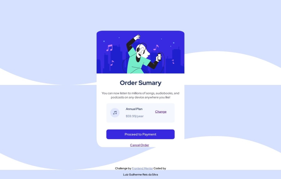
Design comparison
Community feedback
- @Saad-HishamPosted over 1 year ago
Great job on your work! 👏 I have a couple of tips that might help you improve it even further.
Firstly, to prevent the background from repeating, you can set the size to cover and repeat to no repeat. Here's the code you can use:
body {
    background-image: url(images/pattern-background-desktop.svg);
    background-size: cover;
    background-repeat: no-repeat;
}
This will make sure your background image covers the entire page without repeating, giving your site a more polished look.
Secondly, instead of using a div to wrap your content, it's better to use the main element, which is more semantic and helps with accessibility. Here's an example:
<main>
</main>
Finally, when wrapping your cancel button in an a tag, it's a good idea to wrap it in a div as well and give it some margin bottom to match your design. Here's the code you can use:
<div style="margin-bottom: 20px;">
  <a href="#" class="cancel-button">Cancel</a>
</div>
That's all! Keep up the good work and happy coding! 💖
0 - @rrebolledo90Posted over 1 year ago
Apply this and your background will stop repeating vertically.
Body {
background-repeat: repeat-x;}
0
Please log in to post a comment
Log in with GitHubJoin our Discord community
Join thousands of Frontend Mentor community members taking the challenges, sharing resources, helping each other, and chatting about all things front-end!
Join our Discord
