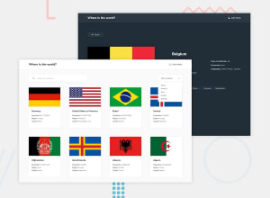
My Rest Countries API Solution with React and Bootstrap
Design comparison
Solution retrospective
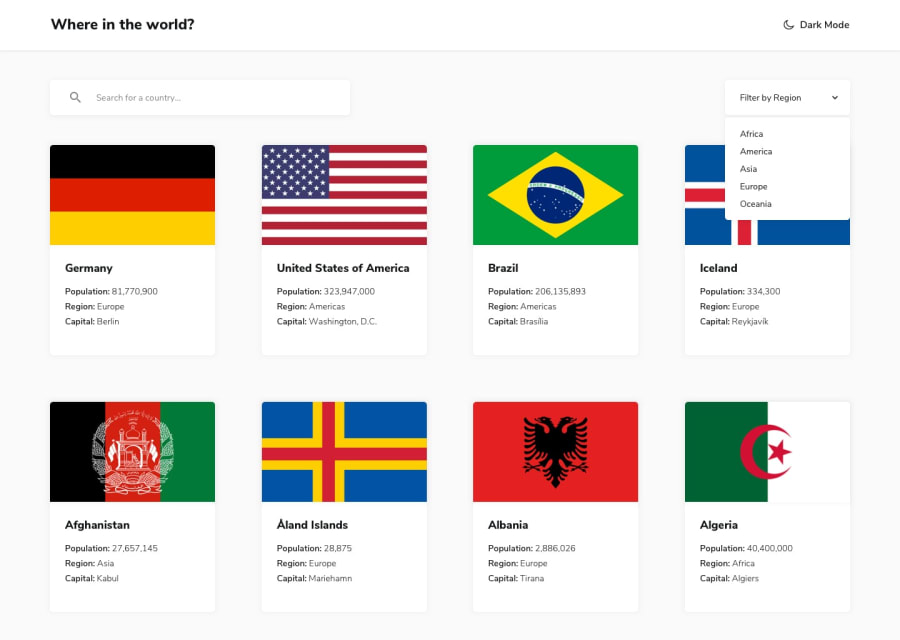
on which screen size frontendmentor takes a screenshot ? does anyone know?
Community feedback
- @tiagobwPosted over 2 years ago
Hi Elena,
The Front-end Style Guide says that the design follows 1440px width for the Desktop version.
So, for the proportions, the height should be 1024px.
I hope that helps.
Great job completing the challenge. :)
Marked as helpful1 - @shashreesamuelPosted over 2 years ago
Hey good job completing this challenge.
Keep up the good work
To answer your question the screenshot is taken on the desktop version
Your solution looks great however I think the the text "dark mode" is supposed to be precede and icon representing a crescent to indicate a clickable action which in turn will activate dark mode.
In terms of your accessibility issues
-
images must have alternative text, simply mention the alt attribute and give a good description of your image
-
Wrap all your content between
maintags to get rid of the rest of accessibility issues.
I hope this helps
Cheers Happy coding 👍
0 -
Please log in to post a comment
Log in with GitHubJoin our Discord community
Join thousands of Frontend Mentor community members taking the challenges, sharing resources, helping each other, and chatting about all things front-end!
Join our Discord
