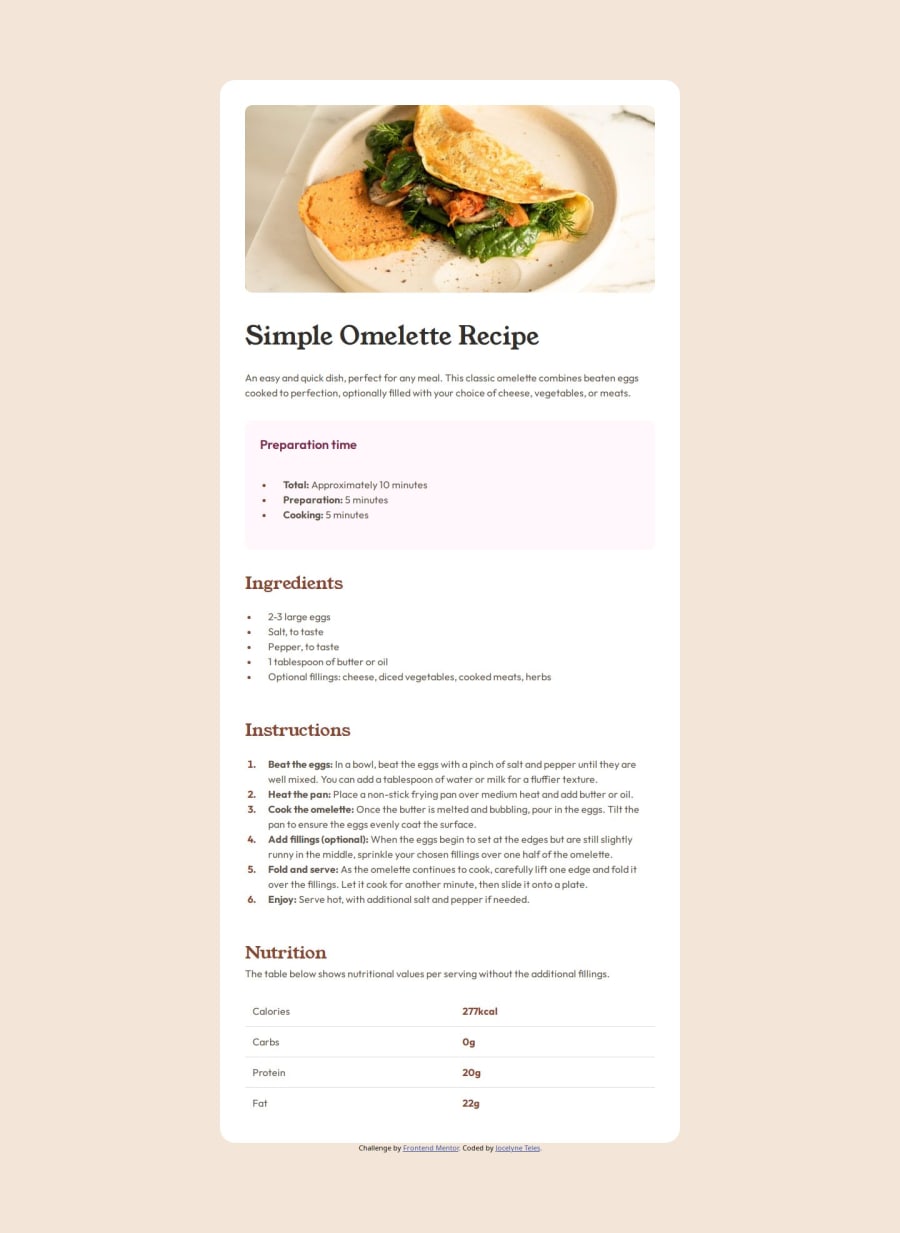
Design comparison
Solution retrospective
I could manage to create a responsive page only using CSS. Also, I learned how to style unordered and ordered list (this is the first time I'm doing it). Next time, I hope to practice more about these aspects of styling a website, specially with responsiveness, which I learned that I should go first with mobile screen sizes, and then tablet and desktop sizes.
What challenges did you encounter, and how did you overcome them?The challenges I encountered:
- List styles: First time I change the colour of the bullets and numbers of the lists, and also changing the padding to fit with the titles and subtitles. I found out some solutions by searching them through W3Schools, MDN, and ChatGPT.
- Responsive: I learn to manage correctly this aspect because I was doing it wrong all the time 😅. I learned that the correct way to approach this is starting with the mobile size, then tablet size, and finally desktop size. Fun fact: With this project, I needed to "delete" (comment, erase, move lines of code) and write the code again to fix this. I overcome this with searching all about responsiveness through internet.
I think I managed well but if you have more information about styling lists and responsiveness, I will be eternally grateful 😊.
Community feedback
- @HIGHZIKdcPosted 6 months ago
Awesome.
1P@JocelyneTeles98Posted 6 months ago@HIGHZIKdc thank you very much! That’s so kind ☺️
0
Please log in to post a comment
Log in with GitHubJoin our Discord community
Join thousands of Frontend Mentor community members taking the challenges, sharing resources, helping each other, and chatting about all things front-end!
Join our Discord
