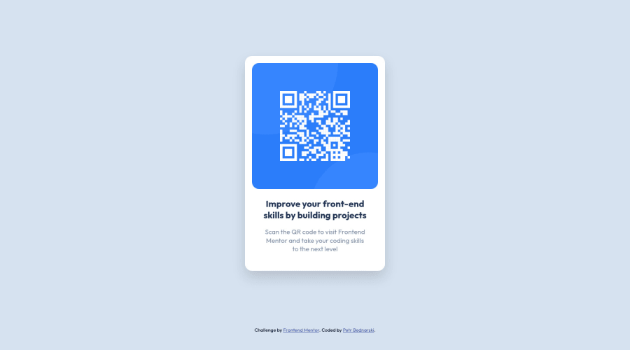
Design comparison
Solution retrospective
What I’m most proud of: I’m most proud of the clean and organized structure of the HTML and the CSS code. The use of flexbox for layout management in the .container and .qr-box classes has made the positioning of elements much easier and intuitive. The responsive design implemented using the @media query ensures that the webpage looks good on devices of all sizes. The use of external fonts and color schemes enhances the overall aesthetics of the webpage.
What I would do differently next time: Next time, I would consider using CSS variables for colors and fonts, which would make the code more maintainable and scalable. If the color scheme or fonts needed to be changed, it would only require a change at one place. Additionally, I would also consider adding more comments in the CSS to explain the purpose of certain styles, making the code more readable for others (or for me in the future). Lastly, I would consider using semantic HTML tags for better accessibility and SEO. For example, the main content could be wrapped in a tag and the title could be in a tag. This would make the webpage more accessible to screen readers and help with search engine optimization.
What challenges did you encounter, and how did you overcome them?One of the challenges I encountered was ensuring the webpage was responsive and looked good on all devices. This was particularly tricky because of the different screen sizes and resolutions of various devices. To overcome this, I used media queries in CSS to apply different styles for different screen sizes. This allowed me to adjust the layout, size, and positioning of elements depending on the device’s screen size.
Another challenge was managing the layout of the webpage. Positioning the elements in the desired layout was initially difficult. To solve this, I used CSS Flexbox which made it easier to design flexible responsive layout structure without using float or positioning.
What specific areas of your project would you like help with?-
Performance Optimization: While the current HTML/CSS code works well for the given design, I would like to learn more about performance optimization techniques. This could include understanding how to minimize reflows and repaints, optimizing CSS selectors, and leveraging browser caching.
-
Accessibility: I would like to ensure that my webpage is accessible to all users, including those with disabilities. I would appreciate guidance on how to effectively use ARIA roles and properties, and how to ensure that the website is fully navigable using just the keyboard.
-
Cross-Browser Compatibility: Ensuring that the webpage looks and functions correctly across all browsers can be a challenge. I would like help in understanding how to handle browser-specific quirks and how to write fallback CSS for older browsers.
-
CSS Preprocessors: I've heard that CSS preprocessors like SASS or LESS can help make the CSS more maintainable and easier to work with. I would like to learn how to integrate a preprocessor into my workflow.
-
CSS Frameworks: While I've written all the CSS from scratch for this project, I'm interested in learning how to use CSS frameworks like Bootstrap or Tailwind CSS to speed up development time and ensure a consistent look and feel.
-
SEO Best Practices: Lastly, I would like to understand more about SEO best practices and how I can structure my HTML to be easily discoverable and indexable by search engines.
Community feedback
Please log in to post a comment
Log in with GitHubJoin our Discord community
Join thousands of Frontend Mentor community members taking the challenges, sharing resources, helping each other, and chatting about all things front-end!
Join our Discord
