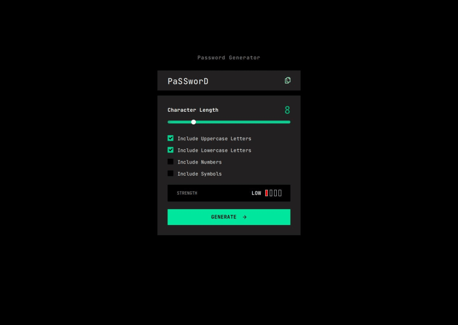
My Password Generator using JS, Flex, CSS, custom checkboxes
Design comparison
Solution retrospective
I am excited about the custom checkboxes I built that kept the green theme, and the animated labels that appear after copying or hitting the button with no boxes checked. I am not confident in my JS solution with the long characters arrays that I push into one long array. Also, I am sure there's a way to reduce the conditionals for the box colors but I can't see how to re-factor those.
What challenges did you encounter, and how did you overcome them?JS script has long blocks that I couldn't figure out how to re-factor. Long arrays and conditionals. It works and I'm looking for feedback.
What specific areas of your project would you like help with?Re-factoring my JS to more concise, targeted syntax.
Community feedback
- P@MatthewPCopePosted 7 months ago
Great job, lots of good things going on. There are a couple functionality issues but other than it looks great. Feel free to take a look at my solution if you want to check out ways to refactor yours. Mine's obviously not perfect but could help you out!
Marked as helpful0
Please log in to post a comment
Log in with GitHubJoin our Discord community
Join thousands of Frontend Mentor community members taking the challenges, sharing resources, helping each other, and chatting about all things front-end!
Join our Discord
