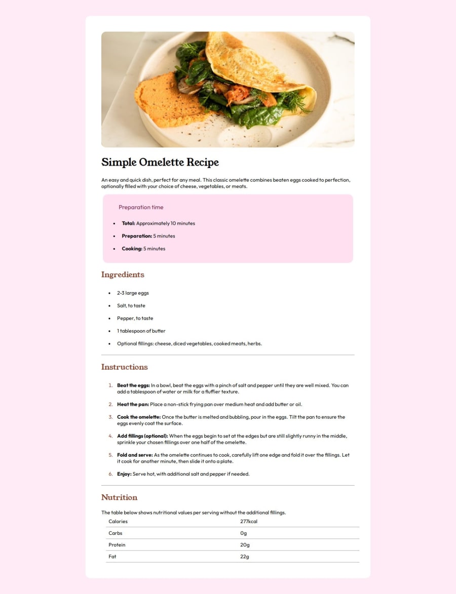
Design comparison
Solution retrospective
i'm most proud of completing it, and i hope next time it could get easier.
What challenges did you encounter, and how did you overcome them?i got a lot of obstacles in the way of my omelette, sometimes i almost give up (yes im very newbie), but with some AI i could learn where my mistake is and solve it.
What specific areas of your project would you like help with?how i could make it more similar to the real one
Please log in to post a comment
Log in with GitHubCommunity feedback
- @QBERT18
Hi there,
I had a chance to review your code and noticed a few areas for improvement, particularly in the design of your CSS. It seems you’re aiming for a utility-based CSS class approach, which can be beneficial. However, it’s important not to overuse utility classes for every element. Additionally, improving the naming conventions of your utility classes could enhance readability and maintainability.
For example: • brown → This could be clearer. • bg-brown-800 → A more descriptive and consistent approach.
Using clear and meaningful class names not only helps you but also makes the code easier for other developers to work with.
Another suggestion is to move your CSS into a separate file instead of embedding it within the <head> of your HTML. This improves code organization and makes your project easier to scale.
Lastly, I noticed that SEO could use some attention. While I understand this is a simple page, and SEO might not have been a priority, it’s still an important aspect. A well-optimized page can significantly improve its visibility on search engines like Google, which is often overlooked but crucial for your project’s success.
Feel free to reach out if you need more help or have any questions—I’d be happy to assist further!
Best regards, Q-bert.
Marked as helpful
Join our Discord community
Join thousands of Frontend Mentor community members taking the challenges, sharing resources, helping each other, and chatting about all things front-end!
Join our Discord
