

Design comparison

Solution retrospective
I think I did a good job with responsiveness. I tried to find the most suitable options to solve the challenge. Also, I went a little bit more far, and create by myself a design for tablets in portrait mode with 2x2 grid which it seems to fit very well to these sizes.
The next time, I hope to have more present the idea of use relative sizes instead of fixed ones. I started using fixed sizes and I noticed that it doesn't work for all devices (even if they're inside of the same media breakpoint).
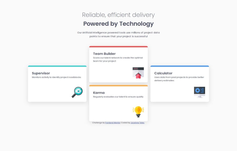
What challenges did you encounter, and how did you overcome them?As I explained a little bit in the last question, the most challenging part was to find the correct sizes that work for multiple screen sizes. I used the grid-template-columns property to create the space to place the cards, and each one of them I put 100% of width to cover corresponding space.
What specific areas of your project would you like help with?As I challenged myself and I set different design for tablets and small screens, I would like to know if my solution is good. Basically, I arranged the middle cards position with a span to fix them in the middle of the grid, but I hide this span and repeat the cards div outside the span for tablets screen sizes. I don't know if it is the only way or if there is another better one. Please, let me know if you have a suggestion and I will be grateful 😉
Community feedback
Please log in to post a comment
Log in with GitHub
Join our Discord community
Join thousands of Frontend Mentor community members taking the challenges, sharing resources, helping each other, and chatting about all things front-end!
Join our Discord