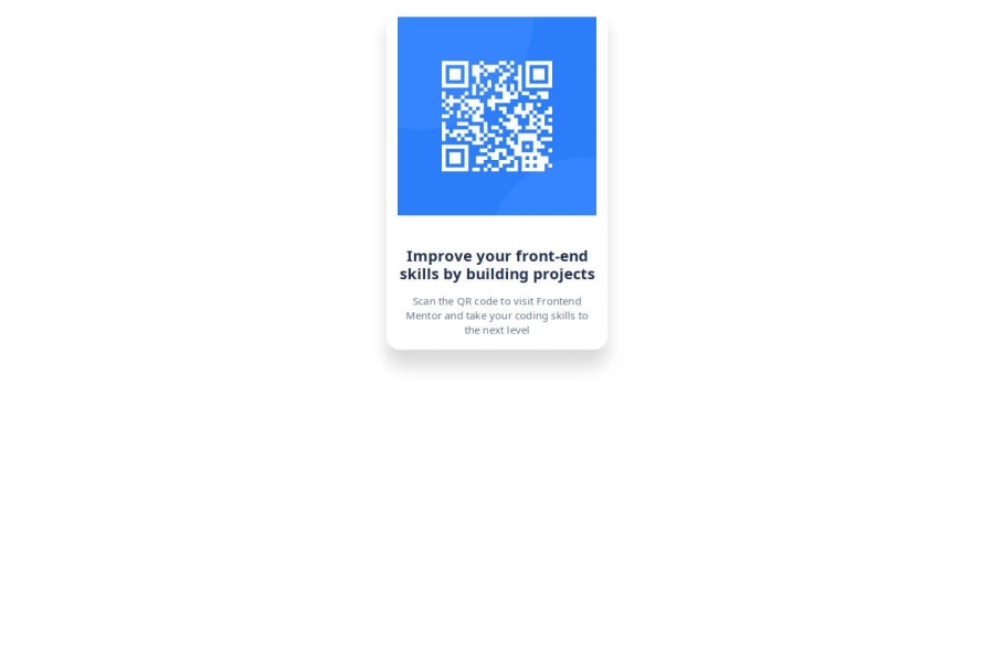
Design comparison
Solution retrospective
I'm very proud that i was able to recreate the Card. Especially the css part ist what made this challenge fun to me ! :)
Next time i might take a closer look into media query and try mobile first - didnt know it was that easy make the component responsive until i asked the Bot for help haha
What challenges did you encounter, and how did you overcome them?i wasn't sure how to structure the css at first, i knew the concept of a container beforehand, but since im lacking practice i didnt think of it when it came to write css myself :D
Chatbot reminded me, glad to learn with KI, would be lost otherwise haha
What specific areas of your project would you like help with?None for now, but best be sure i'm gonna ask for help quite alot from now on :D
Community feedback
Please log in to post a comment
Log in with GitHubJoin our Discord community
Join thousands of Frontend Mentor community members taking the challenges, sharing resources, helping each other, and chatting about all things front-end!
Join our Discord
