Design comparison
SolutionDesign
Solution retrospective
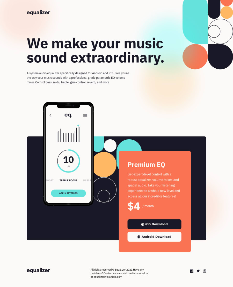
I know that a page of this size is not recommended to do with react, however as I was studying react I decided to do it anyway to see how I would do using the tool. In my view it was full of Workaround seen by some developer, but visually I liked the result, especially the way I positioned the elements and the approach I used to make everything flexible.
Really if you can give me any tips about my use of react I will be happy
Community feedback
Please log in to post a comment
Log in with GitHubJoin our Discord community
Join thousands of Frontend Mentor community members taking the challenges, sharing resources, helping each other, and chatting about all things front-end!
Join our Discord
