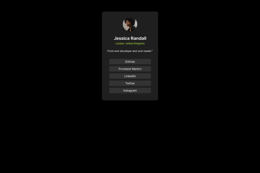
Design comparison
Solution retrospective
I proud of this challenge because is my first challenge in Frontend Mentor so I'm looking that I can be better and improve my knowledge, skills in web design and other things about programming, informatic, computer, etc.
What challenges did you encounter, and how did you overcome them?I didn't encounter nothing in this challenge.
What specific areas of your project would you like help with?I would like to receive help in topics like responsive design.
Community feedback
- @Ezekiel225Posted 9 months ago
Hello there 👋 @Moises2710.
Good job on completing the challenge !
Your project looks really good!
I have a suggestion about your code that might interest you.
📌 First: Use
<main>to wrap the main content instead of<div>.Tags like
<div>and<span>are typical examples of non-semantic HTML elements. They serve only as content holders but give no indication as to what type of content they contain or what role that content plays on the page.Consider adding a min-height of 100vh to the body element so as to centralize your project.
body {
  min-height: 100vh;
  align-items: center;
  display: flex;
  justify-content: center;
}
There is an very useful browser extension called Perfect Pixel that allow you compare with the design image and thus see the exact dimensions. I recommend it to you.
I hope this suggestion is useful for future projects.
Keep up the excellent work and continue to challenge yourself with new projects. Your progress is impressive, and each project is a step forward in your front-end development journey! 🚀🌟.
Other than that, great job!
Happy coding.
1 - @danielmrz-devPosted 9 months ago
Hello @Moises2710!
Your project looks great!
I have one suggestion for you to improve it even more:
- Using
marginis not the best option to center an element. Here's a very efficient (and better) way to place an element in the middle of the page both vertically and horizontally:
📌 Apply this to the body (in order to work properly, don't use position or margins):
body {
    min-height: 100vh;
    display: flex;  /* it works with grid too  */
    justify-content: center;
    align-items: center;
}
I hope it helps!
Other than that, great job!
0 - Using
- @KaushalSonicPosted 9 months ago
Try:
display: grid; place-items: center;
to your main component for center align along the cross and the main axis.
0
Please log in to post a comment
Log in with GitHubJoin our Discord community
Join thousands of Frontend Mentor community members taking the challenges, sharing resources, helping each other, and chatting about all things front-end!
Join our Discord
