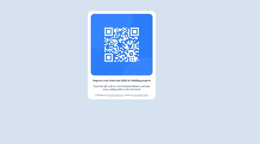
My first project in frontend mentor code scanner
Design comparison
Solution retrospective
please if you have any question or note for the code, write a comment.
Community feedback
- @Lo-DeckPosted over 1 year ago
Well done, you finished your first challenge too.
Marked as helpful0 - @HassiaiPosted over 1 year ago
Replace <div class="container"> with the main tag and <p class="firstP"> with <h1> to make the content/page accessible. click here for more on web-accessibility and semantic html
Every html must have <h1> to make it accessible. Always begin the heading of the html with <h1> tag wrap the sub-heading of <h1> in <h2> tag, wrap the sub-heading of <h2> in <h3> this continues until <h6>, never skip a level of a heading.
Give the alt attribute in the img a value. The value of the alt attribute is the description of the image. For decorative images like icons, there is no need to give it an alt value, for more on alt attribute Click here.
Use the font-family that were given in the styleguide.md found in the zip folder you downloaded.
to center .container on the page using flexbox or grid instead of margin,
- USING FLEXBOX: add min-height:100vh; display: flex; align-items: center: justify-content: center; to the body
body{ min-height: 100vh; display: flex; align-items: center; justify-content: center; }
- USING GRID: add min-height:100vh; display: grid place-items: center to the body
body{ min-height: 100vh; display: grid; place-items: center; }
For a responsive content,
- Replace the width in .container a max-width and reduce its value
max-width: 320px which is 20rem/em
- Give the img a max-width of 100% and a border-radius value, the rest are not needed.
Give h1 and p the same font-size of 15px which is 0.9375rem, text-align: center, the same margin-left, margin-right and margin-top values. Give p a margin bottom value.
Use relative units like rem or em as unit for the padding, margin, width values and preferably rem for the font-size values, instead of using px which is an absolute unit. For more on CSS units Click here and here
Hope am helpful.
Well done for completing this challenge. HAPPY CODING
Marked as helpful0@abdelghaniGRDPosted over 1 year ago@Hassiai hello friend, i updated the code, i use the main and h1, and the grid for center the contents inside the main. Question: what is the difference if i pute these (min-height:100vh; display: grid place-items: center) in the body or if i put them in the main. bacause in the first try as you see i put them in the .container (main now) and i don't see anything change in the code. can you preview the code know please? https://abdelghanigrd.github.io/ghani-repo/
0@mksoofianPosted over 1 year ago@abdelghaniGRD
@Hassiai made some good suggestions. As you can see, there are many ways to achieve the same result and you did a great job adjusting. Regarding your question in the above comment:
When you add
display: flex
ordisplay:grid
, you are applying flex or grid to everything inside the container.On your website currently, you applied it to the body. Therefore,
place-items: center
is centering your card accordingly (as desired).However, if you applied that same CSS to the
main
component, it would try centering each item within the grid.Here is a great resource for flexbox: https://css-tricks.com/snippets/css/a-guide-to-flexbox/
I hope this helped!
Marked as helpful1 - @mksoofianPosted over 1 year ago
Hey Abdel,
Nice first attempt here. I'm no pro but here is some feedback that I hope is helpful to improving your code:
-You can remove the <div class="attribution">, it is only meant as a placeholder in the starting code. Removing it will help you execute your project more accurately as well.
-This is not a responsive project, or at least not required. Therefore, you can remove the media query. Additionally, I tend to format it as @media (max-width: XXpx). When the screen size is less than the max-width, it will execute the code within your media query.
-Remove from Body:
- margin: 26px
- width: 90% After I did this, your design actual centered better on the page. I would actually recommend setting the margin to "0" as the Browser automatically is putting on some margin here and we should reset that unless you intentionally want it there.
-It is good practice to fill out the alt=" " in your <img>. This is what they call "accessibility" in coding. People who are visually impaired, the screen reader will read them what the alt=" " is since they can't see there is a QR code there. So, in this case you would write something simple like, alt="QR code".
-You can remove the font weight on the main <p> text as it is not doing anything really. It is superfluous as your font is already at that weight.
There are a few approaches to getting the <p> to split into three rows but I will spare you unless you want help. Let me know.
TIPS: I checked your site by using the chrome dev tools. I would suggest you familiarize yourself with how to use it. It makes really easy to play with without affecting your actual code.
Also, check out Kevin Powell on youtube. He is really fantastic to watch on youtube and explains things very well. I have and continue to learn a lot from his content.
Wishing you the best of luck on your coding journey! Mike
Marked as helpful0@abdelghaniGRDPosted over 1 year ago@mksoofian hello friend, thanks for your tips to improve my code, i really improve it can you check it please? and in my git repos you will find a screenshot of a problem i face it when i switch the site to preview like mobile, i see margin right, and i don't know what is the problem. thanks abdel.
0@mksoofianPosted over 1 year ago@abdelghaniGRD
Of course.
If your question is: Why is the right side of my card slightly cut off when viewing on mobile (iphone 375px * 667px)?
My solution would be to set add "margin:0" to your Body element.
Worked for me when I tried in chrome :) Let me know!
Marked as helpful0@abdelghaniGRDPosted over 1 year ago@mksoofian hello friend, i improve my code with adding a translate and position properties to center the div horizontally and vertically. can you check it ?
0
Please log in to post a comment
Log in with GitHubJoin our Discord community
Join thousands of Frontend Mentor community members taking the challenges, sharing resources, helping each other, and chatting about all things front-end!
Join our Discord