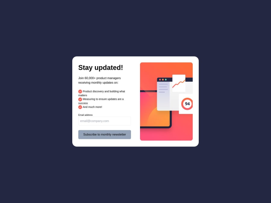
Design comparison
Solution retrospective
My first JS/React/Next/TailwindCSS project required a lot of research. Everything was new to me, but I had a lot of fun with it. However, it also made me feel tired at times. The most difficult part in the project was typography and layout. The project looks complete, but the details are not up to par, especially in terms of code optimization. I have a feeling that there will be a lot of bugs.
Thanks
thanks @AlexKMarshall and @ItsKrish01 for helping me to resolve next redirect problem
Community feedback
- @Youssif94Posted over 1 year ago
Design looks good, but the input doesn't work, whatever I type it doesn't bring me to the second page to say " sign up complete " it just refreshes the page
Marked as helpful0@korosuPosted over 1 year ago@Youssif94 strange, it working fine after my test, the input accept only email format without any space
0@korosuPosted over 1 year ago@Youssif94 I have found the bug. When you press 'Enter' in the input box, it triggers the default form submission event. I don't know how to prevent this behavior at the moment, and how to bind my own function to handle it.
1
Please log in to post a comment
Log in with GitHubJoin our Discord community
Join thousands of Frontend Mentor community members taking the challenges, sharing resources, helping each other, and chatting about all things front-end!
Join our Discord
