Design comparison
Solution retrospective
Hello,
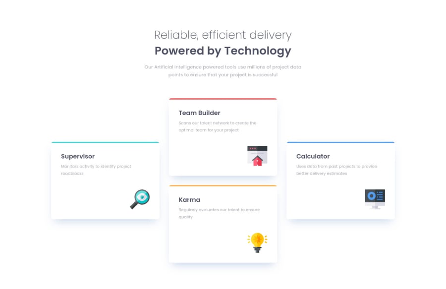
This is my first CSS GRID experience, it was really fun. I could have done it with flex but the result would not be so clean.
I am very open for constructive feedback !
🤘🤘🤘
Community feedback
- @brasspetalsPosted almost 4 years ago
Hi, David! Congrats on completing another solution! 🎉
Overall, you did a good job, and it responds very nicely. My only suggestion on that front is to add a
max-widthto your cards container for mobile styling, as the cards tend to get pretty stretched between about 500px-700px. Having them match closer in width to the heading text would look nicer.To clear up your accessibility errors:
- For “Document should have one main landmark”, use a
mainelement to wrap the content of your page, and apply your position styling (padding, margin, display, etc.) to that rather than directly on the body. This will hopefully also clear up the other “landmark” errors in the report - not entirely sure as I’m not familiar with the new report system yet. 🤞 - For “Page should contain a level-one heading”, I suggest wrapping both of your headings in the
.heading-sectionin a single h1 tag (rather than an h3 and h2) with aspanaround “powered by technology” in order to apply the bolder styles. You can control the line break through setting awidthormax-widthwithchunits.
Hope my suggestions help! Happy coding! 😄
Marked as helpful1@hmadamkPosted almost 4 years ago@brasspetals yeah the cards is stretching to much
0 - For “Document should have one main landmark”, use a
- @RMK-creativePosted almost 4 years ago
Hi David! No feedback other than it looks awesome, nice work 😃
Marked as helpful1
Please log in to post a comment
Log in with GitHubJoin our Discord community
Join thousands of Frontend Mentor community members taking the challenges, sharing resources, helping each other, and chatting about all things front-end!
Join our Discord
