Design comparison
Solution retrospective
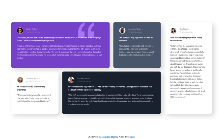
With this project I got to learn how css grid works. I think the most difficult part of this project for me had to be positioning inside each testimonial box, figuring out spacing and padding of the box itself. This wasn't super difficult to do and I had fun doing it. I would love advice on cleaning up my css and making it look a little more readable.
Community feedback
- @correlucasPosted about 2 years ago
👾Hello @KeithLion, congratulations on your new solution!
I’ve some suggestions for you:
Your html is working but you can improve it using meaningful tags and replace the divs, for example the main div that takes all the content can be wrapped with
<main>or section, about the cards you can replace the<div>that wraps each card with<article>you can wrap the paragraph with the quote with the tag<blockquote>this way you'll wrap each block of element with the best tag in this situation. Note that<div>is only a block element without meaning, prefer to use it for small blocks of content.This article from Freecodecamp explains the main HTML semantic TAGS: https://www.freecodecamp.org/news/semantic-html5-elements/
✌️ I hope this helps you and happy coding!
Marked as helpful1
Please log in to post a comment
Log in with GitHubJoin our Discord community
Join thousands of Frontend Mentor community members taking the challenges, sharing resources, helping each other, and chatting about all things front-end!
Join our Discord
