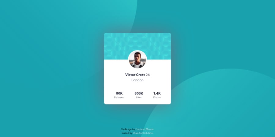
Design comparison
SolutionDesign
Solution retrospective
This is my first Frontend Mentor challenge.
Struggled a little with the background SVGs placement. There can be many other ways of doing this but I wanted to practice my skills so I took my time to make the page like as close to the design as possible.
Feedback is welcome. Please mention anything which is not a good practice.
Community feedback
Please log in to post a comment
Log in with GitHubJoin our Discord community
Join thousands of Frontend Mentor community members taking the challenges, sharing resources, helping each other, and chatting about all things front-end!
Join our Discord
