Design comparison
SolutionDesign
Solution retrospective
Feel free to post any feedback.
Community feedback
- Account deleted
Hi,
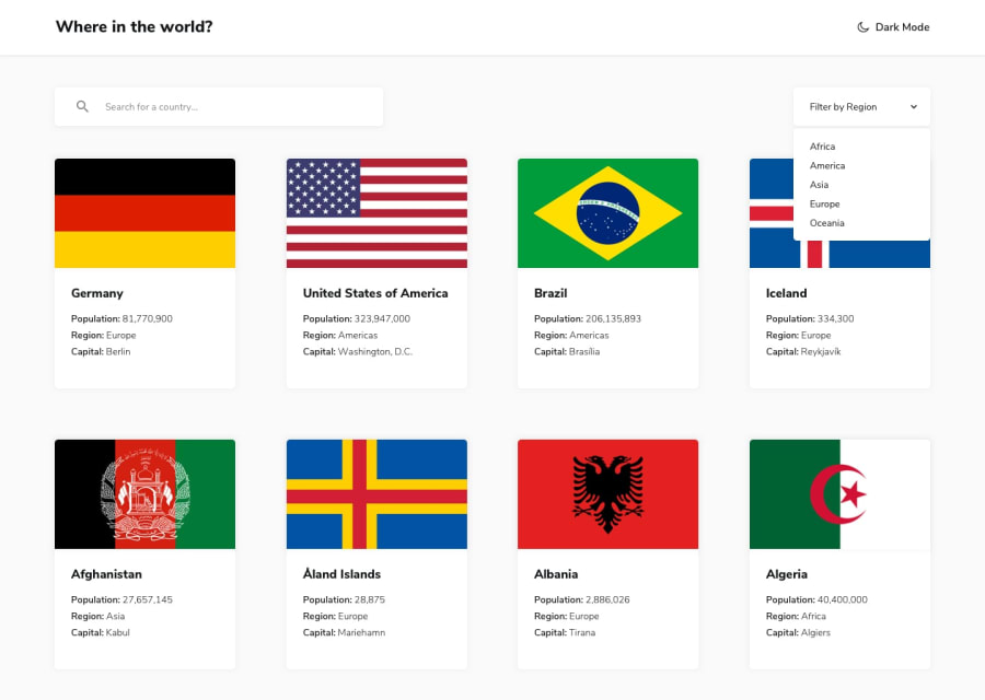
Your solution looks quite good though I am not sure why I am only seeing a few of them countries at first, or you should at least had a pagination to load the others or have a load more button, but nonetheless I think it looks good.
1@makjnr317Posted about 3 years ago@thulanigamtee Thanks for the comment, i thought that on the initial load it was only supposed to show 8 countries only, and then show more when you filter. Will change that.
0Account deleted@makjnr317 My bad, I haven't done this challenge but a 'load more button' would come in handy.
0
Please log in to post a comment
Log in with GitHubJoin our Discord community
Join thousands of Frontend Mentor community members taking the challenges, sharing resources, helping each other, and chatting about all things front-end!
Join our Discord

