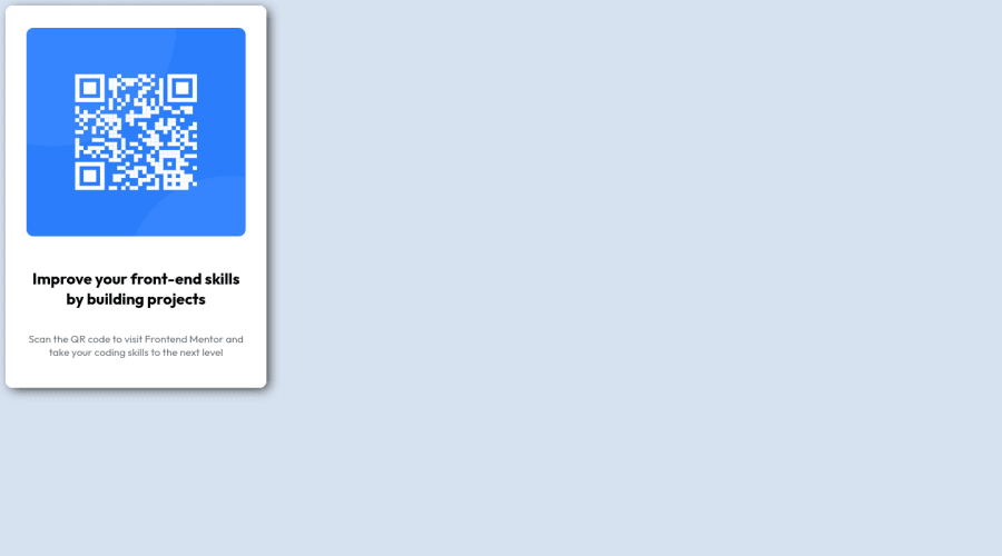
My first desktop solution using traditional box model
Design comparison
Solution retrospective
Hello everybody,
First of all thank you for taking your time to review my solution.
So, I did not know how to round the image edges. I tried to add the "border-radius" image property, but I didn't seem to work.
Plus my image do not seem to be neither vertically, nor horizontally centered, even though I've written CSS code to make it happen..
Thank you!
Community feedback
- @0xabdulkhaliqPosted over 1 year ago
Hello there 👋. Congratulations on successfully completing the challenge! 🎉
- I have other recommendations regarding your code that I believe will be of great interest to you.
HTML 🏷️:
- This solution generates accessibility error reports, "All page content should be contained by landmarks" is due to
non-semantic
markup, which causes lacking of landmark for a webpage
- So fix it by replacing the
<div id="card">
element with the semantic element<main>
in yourindex.html
file to improve accessibility and organization of your page.
- What is meant by landmark ?, They used to define major sections of your page instead of relying on generic elements like
<div>
or<span>
- They convey the structure of your page. For example, the
<main>
element should include all content directly related to the page's main idea, so there should only be one per page
HEADINGS ⚠️:
- And, this solution has also generated accessibility error report due to lack of level-one heading
<h1>
- Every site must want at least one
h1
element identifying and describing the main content of the page.
- An
h1
heading provides an important navigation point for users of assistive technologies, allowing them to easily find the main content of the page.
- So we want to add a level-one heading to improve accessibility by reading aloud the heading by screen readers, you can achieve this by adding a
sr-only
class to hide it from visual users (it will be useful for visually impaired users)
CSS 🎨:
- let me explain, How you can easily center the component.
- We don't need to use
margin
andpadding
to center the component both horizontally & vertically. Because usingmargin
orpadding
will not dynamical centers our component at all states
- To properly center the component in the page, you should use
Flexbox
orGrid
layout. You can read more about centering in CSS here 📚.
- For this demonstration we use css
Grid
to center the component
body { min-height: 100vh; display: grid; place-items: center; }
.
I hope you find this helpful 😄 Above all, the solution you submitted is great !
Happy coding!
1 - @SoniBasantPosted over 1 year ago
- Use below code in body
display: flex; align-items: center; justify-content: center;
Your card will be centered.
-
At least one h1 heading is necessary, so change h2 into h1 and give font-size as needed.
-
You don't add language. Add it in html tag-
<html lang="en">
- You don't use
<!DOCTYPE html>
necessary for browser and<meta>
tag contains information about html document. As these are already present in the html file given with this project, means you did not use that file.
If you feel you don't need it, it's totally fine. You can type these lines.
OR
If you are using VS Code you can just type ! in html file and select first option from pop-up. And Bang! your boilerplate is ready
-
You don't add fevicon. Image is given with the project. Add the link tag in head.
-
I made some changes in your html file and css file in GitHub. Please have a look. And accept pull request if you feel good.
Good Luck Fabio F. : )
0 - @DrMESAZIMPosted over 1 year ago
hi Fabio F.
I noticed you requested feedback on how to center you soution at the center of the page , here are suggestion . inside your CSS file set the properties of the id "card" to
#card { width: 50%; margin: auto; height: 550px; /* border: 2px solid black; */ box-shadow: 5px 4px 15px -2px #2E2E2E; border-radius: 10px; overflow: hidden; background-color: hsl(0, 0%, 100%); position: relative; top: 50%; transform: translate(0, -50%); }
If you find my suggestions difficult to implement . You can join us for our weekly live streams where we assists other developers by providing helpful reviews and feedback with live Frontend mentor code edits and reviews on this link. Your solution will also be reviewed and edited by myself live l ink here >> v https://youtube.com/live/L6WTd7HRTMM?feature=share
0
Please log in to post a comment
Log in with GitHubJoin our Discord community
Join thousands of Frontend Mentor community members taking the challenges, sharing resources, helping each other, and chatting about all things front-end!
Join our Discord