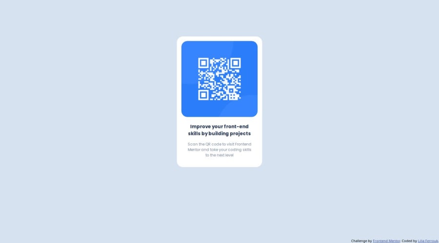
Design comparison
Solution retrospective
I really enjoyed working on this small challenge ! feel free to leave your feadback <3
Community feedback
- @danielmrz-devPosted 9 months ago
Hello @liliaferrouk!
Your project looks great!
I have one suggestion for you to improve it even more:
- Using
marginis not the best option to center an element. Here's a very efficient (and better) way to place an element in the middle of the page both vertically and horizontally:
📌 Apply this to the body (in order to work properly, don't use position or margins):
body {
    min-height: 100vh;
    display: flex;  /* it works with grid too  */
    justify-content: center;
    align-items: center;
}
Using Tailwind, that would be
<body class="min-h-screen flex/grid justify-center items-center">.I hope it helps!
Other than that, great job!
Marked as helpful2@liliaferroukPosted 9 months agoHello @danielmrz-dev
Thank you for your feedback and for sharing your suggestion for improvement.I appreciate your contribution and encouragement!
1 - Using
- @Islandstone89Posted 9 months ago
Hi Lilia, here is my feedback.
HTML:
-
Every webpage needs a
<main>that wraps all of the content, except for<header>andfooter>. This is vital for accessibility, as it helps screen readers identify the "main" section of a page. Change.containerinto a<main>. -
The alt text should be written naturally, without using
-between the words. Write something short and descriptive, without including words like "image" or "photo". Screen readers start announcing images with "image", so an alt text of "image of qr code" would be read like this: "image, image of qr code". The alt text must also say where it leads(frontendmentor.io). -
.attributionshould be a<footer>, and its text must be wrapped in a<p>.
CSS:
-
It's good practice to include a CSS Reset at the top.
-
Add around
1remofpaddingon thebody, so the card doesn't touch the edges on small screens. -
Remove the margin on the card.
-
To center the card horizontally and vertically, use Flexbox on the body:
display: flex; flex-direction: column; justify-content: center; align-items: center; min-height: 100svh;-
Remove the width and height on the card. You rarely want to set fixed dimensions, as this can cause overflow if the viewport is smaller than the fixed size.
-
Add a
max-widthof around20remon the card, to prevent it from getting too wide on larger screens. -
font-sizemust never be in px. This is a big accessibility issue, as it prevents the font size from scaling with the user's default setting in the browser. Use rem instead. -
Since all of the text should be centered, you only need to set
text-align: centeron the body, and remove it elsewhere. The children will inherit the value. -
font-familyshould also be placed on thebody, and removed elsewhere. -
Paragraphs have a default value of
font-weight: 400, so there is no need to declare it. -
Remove the margin and width on the image. Add
display: blockandmax-width: 100%- the max-width prevents it from overflowing its container.
Marked as helpful1@liliaferroukPosted 9 months ago@Islandstone89 Thank you for your detailed feedback. I appreciate so much <3
1 -
Please log in to post a comment
Log in with GitHubJoin our Discord community
Join thousands of Frontend Mentor community members taking the challenges, sharing resources, helping each other, and chatting about all things front-end!
Join our Discord
