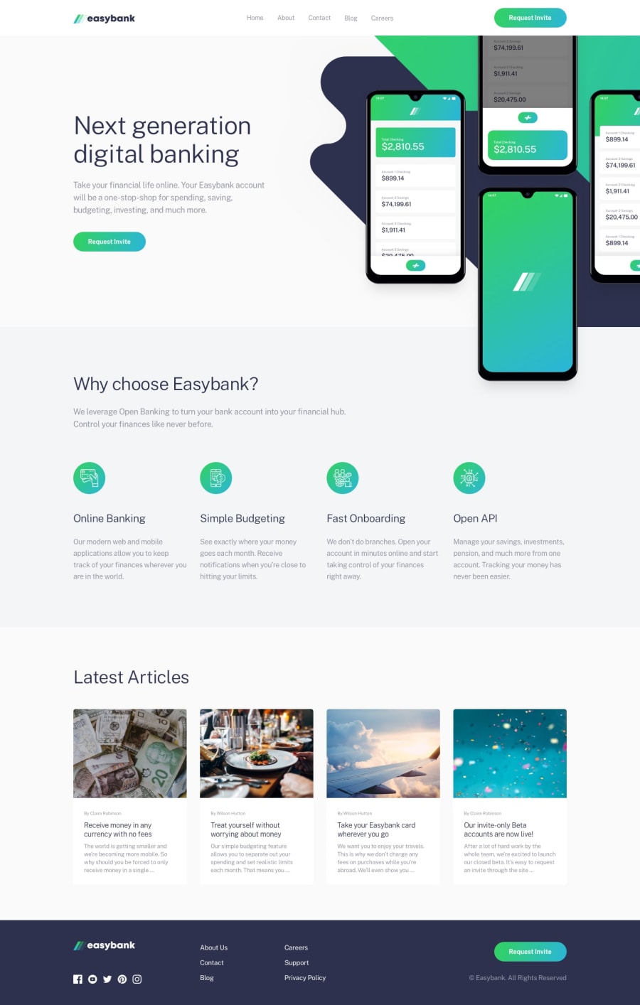
My first complete Landing page using HTML SASS and JavaScript
Design comparison
Solution retrospective
This took a very long time to complete!! On my first Landing page using SASS, I have followed Mobile-First Principle and BEM naming convention for SASS. I have also animated the mobile burger menu for the first time and I think it is the best part of the project. I am open to receive any feedback positive or negative. I'll use all the feedback to improve upon my skills. Thanks for taking the time and looking at my code.
Community feedback
- @grizhlieCodesPosted over 3 years ago
Hi Ameya!
Overall, great work and clean code, with nice and ease-to-understand classes. Also good use of SASS.
I now have a suggestion and a question 😁
**Suggestion: ** Try building the entire header+navigation with just 1 nav element. It may seem counter intuitive but it's not all that difficult to style it and seeing your code makes me think you might have considered this already.
There is a tiny bug with your navigation: open up the mobile-menu, drag your screen to the next breakpoint and the mobile AND tablet/desktop nav still show. This is easy to fix so whatever way your prefer works fine I'm sure.
I guess it's important to note that the way I code headers (with 1 set of html) is simply due to having tried it once and i just sort of stuck to it. So there's a bucket of bias with my suggestion 😎
Question: Looking through your mixins I noticed you do a breakdown-up and -down. Why is that?
I ask because when coding I start on a mobile-first design and then I simply code for tablet, and eventually, desktop. I find this to be the simplest way -> start from the simplest design iteration (always mobile, always basic single column layout) and increase the complexity as you increase and traverse through the next breakpoints with min-width.
So I'm trying to udnerstand the benefit of having max-width also, could you please explain your logic/benefits of also having breakpoint-down?
Awesome work overall 👍
2@ameyadeokulePosted over 3 years ago@grizhlieCodes Your Answer: The mixins are for showing elements above or below certain screen sizes. If there would have been a requirement to show something below a certain screen size then I would have used a breakdown-down mixin and vice-versa, it helps to keep the code organized. The max-width is to not allow flex elements to grow out of proportion and always center themselves in case of larger screen sizes. I will surely try to use your suggestions and fix the bug as soon as possible. The multiple navs were because of the overlay which was to be added on the nav class itself so that I could write less JS. Again Thanks for the feedback, I appreciate that you took the time out look at my code.
1 - @pikapikamartPosted over 3 years ago
Hey, really really good job on this one. I haven't seen any issue regarding the layout. Both looks good in desktop as well in mobile.
Regarding your BEM, well I think it is fine for now, but using BEM is really to make reusable and extensible components. When using BEM, make sure that the component is reusable because that is the goal of using it. It is not just using a block then just making
__
elements, it is more of using a block, providing it is general. General in a way, it could be use in other sections, and not specific for a single component, because if you do that, then that is not BEM anymore.So, how can we Identify a possible block in our BEM principle? Well, a tip is that, reviewing the layout itself. While looking at it, take note of every section, identify similarities because those similarities will be you reusable components right. Well it somewhat tedious but that will really help you to make more good components.
Overall, you did a good job^^
2@ameyadeokulePosted over 3 years ago@pikamart Thanks for your feedback, I would add that I have extensively used flex classes on classes that have flex properties and container class on all sections to add the required padding. Again thanks for providing more insights on BEM and I'll make sure to work on your feedback on using more general sections styles.
1@grizhlieCodesPosted over 3 years ago@pikamart Great feedback for ameya (and myself), I didn't know I was using BEM wrong hehe, I'll improve on how I use it in my future projects.
Cheers 😁
1 - @argelomnesPosted over 3 years ago
Hey Ameya,
This is neat! I love it when someone takes the time to also make their solution look good on medium screens even if there's no design provided.
At first, I was thinking why not name
feature-icon
asfeature__item__icon
. But looking atfeature
as your top-level block, I think your naming makes more sense. May I know your thought process on this?1@ameyadeokulePosted over 3 years ago@argelomnes It's a naming convention we can follow while writing CSS known as BEM. It is used for making reusable components/sections. You can know more about it here -> https://css-tricks.com/bem-101/
1
Please log in to post a comment
Log in with GitHubJoin our Discord community
Join thousands of Frontend Mentor community members taking the challenges, sharing resources, helping each other, and chatting about all things front-end!
Join our Discord