My First Collaboration Projet Order summary component
Design comparison
Community feedback
- @grace-snowPosted over 1 year ago
Hello, feedback as promised 😁
- You are misunderstanding how to use landmark elements in this. All content should be within a landmark, and every page should minimally have a
main. This is one single component so everything inside it should be within main, that's not just for part of the card..grid_containershould be the main element - Do not set explicit widths on a component like this. Instead, give
.grid_containera max-width only. - The image does not need wrapping in a div. Only add extra html when you need to
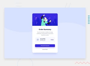
- The image has incorrect alt text. If you feel the image is decorative, alt can be blank. If you feel the image is valuable content for the page it must have a proper description of what it looks like
- As you're using grid for the grey box with all the pricing info in, you do not need to nest extra grids inside it! There's just no reason for all these divs. You're over-complicating it.
- The icon can have an explicit width and height and definitely does not need an alt description. It's decorative, so leave the alt blank
- I don't know why the price has had each part of it wrapped in a span. Again, avoid unnecessary html
- It doesn't look like you're used the colors from the design, and the sizing doesn't match. Try to get it all much closer. e.g. proceed is full width in the design...
- There's no reason to wrap proceed and cancel in divs
- As above, make sure you add hover and focus-visible styles to every interactive element. Focus-visible styles must include a noticeable outline on all sides, it is meant to be practical, not pretty, to help keyboard users know where they are on a page
Lastly, this is more of a question for you - if this was a real project what would you expect to happen on click of each of these? a) Change b) Proceed c) Cancel How you answer for each one determines what element each of those should be
Marked as helpful1 - You are misunderstanding how to use landmark elements in this. All content should be within a landmark, and every page should minimally have a
- @visualdennissPosted over 1 year ago
Solution looks great! Congrats on a successful trio collaboration!
Only thing i'd like to add is that you guys can add some background-color change on button hover, to emphasise button even more. (Also color change on links hover) u can do like button:hover { background-color: some-value} also you can add button { transition: background-color .4s ease} for a smoother transition for example.
Hope you guys find my feedback helpful!
Marked as helpful1
Please log in to post a comment
Log in with GitHubJoin our Discord community
Join thousands of Frontend Mentor community members taking the challenges, sharing resources, helping each other, and chatting about all things front-end!
Join our Discord
