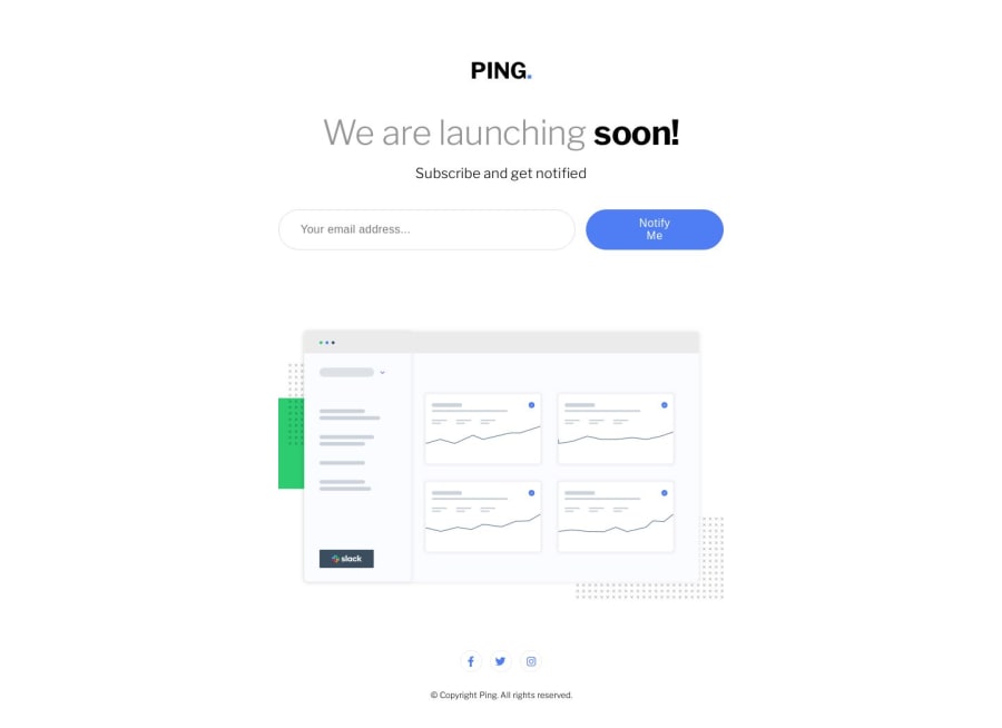
Design comparison
SolutionDesign
Solution retrospective
Hello! This is my first challenge with JS. Any tips how can I improve my code is welcome! Thanks
Community feedback
- P@FluffyKasPosted about 1 year ago
Heyo,
Looks pretty good! JS wise the only thing I'd double-check is the regex. test@test passed as a valid email address even though it's not exactly valid.
Semantic markup:
- You should wrap everything in a <main>. This could be instead of the div called main-wrapper. Alternatively, you can separate the content of the page into header (ping logo), main (form and image) and footer (socials).
- The social links should be actual links with aria-labels describing where they lead. Best to wrap these in a <ul>.
- The input and button should be wrapped in a <form>. A label is also missing. Each input should have a label describing what they do, a placeholder is not a reliable equivalent of this. Since the design doesn't contain the label itself, it can be easily hidden with an sr-only (for screen readers) class, like so:
.sr-only {
position: absolute;
width: 1px;
height: 1px;
padding: 0;
margin: -1px;
overflow: hidden;
clip: rect(0, 0, 0, 0);
white-space: nowrap;
border-width: 0;
}
CSS:
- The mobile and desktop sizes are good, but the tablet size is a bit lacking. You could give a max-width to the image and to the form as well so they don't stretch the whole width of the screen.
- The input has a huge left padding in desktop view, you could perhaps reduce this a bit to look nicer.
- Socials: I saw this code there:
@media (min-width: 1440px)
.social-wrapper {
    padding: 0rem 40.9375rem;
}
.social-wrapper {
    display: grid;
    grid-template-columns: repeat(3, 1fr);
    grid-template-rows: 1fr;
    padding: 0rem 7.8125rem;
}
I see what you're trying to achieve here but instead of the huge padding, you could do something easier:
display: flex;
justify-content: center;
gap: 1.5rem; (note that this is just a guess)
This would be a bit harder to achieve with a grid, at least how you have done it. With flexbox you probably won't even need a media query.
I hope I was able to help! (:
Marked as helpful1
Please log in to post a comment
Log in with GitHubJoin our Discord community
Join thousands of Frontend Mentor community members taking the challenges, sharing resources, helping each other, and chatting about all things front-end!
Join our Discord
