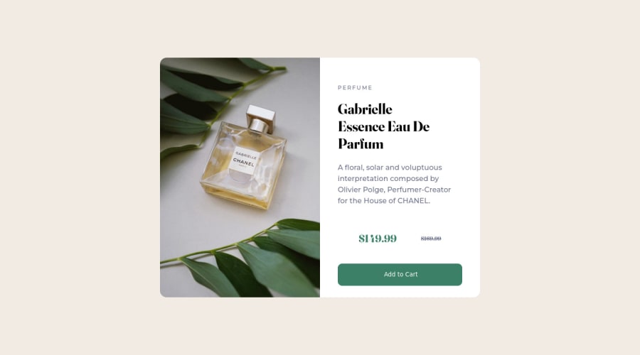
My first challenge HTML / CSS - Product preview card component
Design comparison
Solution retrospective
This is my first HTML/CSS challenge so if you see bad details in the code or bad organization of the elements, don't hesitate to tell me, so I can avoid keeping these potential bad habits. But I wonder especially how to change the text in css with the media queries? In this challenge, we can see in desktop version "Gabrielle <br /> Essence Eau De Parfum" and after in mobile version "Gabrielle Essence <br /> Eau De Parfum". How i can change that ? Thank you. Have a good day.
Community feedback
- @ferlagherPosted over 2 years ago
Hi, nice work with your solution! I like the hover effect on the button! 👍🏻
You don't need to use
<br/>for the line break! In this case, the difference between desktop and mobile layout is due to the padding of the right/bottom container. It's a bit hard to notice, but it's slighty bigger in the desktop view, that makes the text wrap erlier than in the mobile view.Also, I reccomend the
<picture>container for the img. You can specify many sources for your image and when they displayed or not, depending on the viewport. I personally find this way easier than using media queries. And you can give your<img>awidth:100%and aheight:autoto keep the aspect ratio.Marked as helpful0 - @snehamoybagPosted over 2 years ago
Hi @Fidget836 🙋♂️
Congratulations on completing your first challenge 👏 really good stuff 👏
Usually
<br>tag is used to signify a line break so using it in a single sentence is semantically a bad idea. Instead you can set the title amax-widthusing the super usefulchunit, where ch stands for characters.h1 { max-width: 15ch; }LEARN MORE
And if you want change the width of the title for wider screens you can use the media queries
@media (min-width: 720px) { h1 {max-width: 10ch;} }*This change of style will appear when the screen resolution is 720px or more 😄 *
Learn more about Media Queries
Marked as helpful0 - @oallelsefailoPosted over 2 years ago
Hey!
There are certain ways you can get the text to drop (
width/font-size/line-heightetc). But since you put the<br>within the text itself, when the media queries kick in, it's still going to be reading that break in there.Also make sure to put some info in the
alttags. Something even I forget from time to time.0
Please log in to post a comment
Log in with GitHubJoin our Discord community
Join thousands of Frontend Mentor community members taking the challenges, sharing resources, helping each other, and chatting about all things front-end!
Join our Discord
