Not Found
Not Found
Not Found
Not Found
Not Found
Not Found
Not Found
Not Found
Not Found
Not Found
Not Found
Not Found
Not Found
Not Found
Not Found
Not Found
Not Found
Not Found
Not Found
Not Found

Submitted

my first challenge ever - feedback appreciated

@zerozuckerx

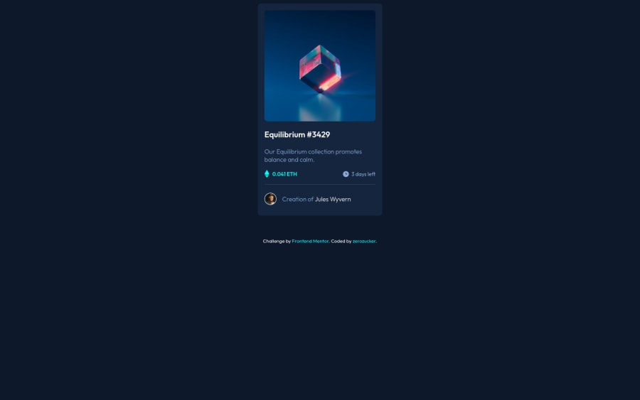
Desktop design screenshot for the NFT preview card component coding challenge

This is a solution for...

  • HTML
  • CSS
1newbie
View challenge

Design comparison


SolutionDesign

Solution retrospective


I'm very happy with how it turned out visually but my code is, I think, quite messy - especially the positioning.

The hover state of the etherium picture took a very long time. The eye-icon should be 100% opacity while the rest of the background should be around 30%. Also the eye-icon is not square and I didn't know how to get the borders overlapping on each side.

I'm still confused of the standard positioning of the items inside the divs (balancediv, timediv and creator). The picture seemed to be positioned top left inside the div, while the text (p) was positioned on the bottom.

Any insight would be highly appreciated.

Community feedback

Abdul 8,540

@Samadeen

Posted

Hey!! Cheers 🥂 on completing this challenge.. . Here are my suggestions 1.You should use <main class="card"> instead of <div class="card">. 2. Go down orderly when you are using the headings h1 down to h2 down to h3 and so on. 3. You can adjust the margin of the card to center it example: margin: 10rem auto; This will center your card in the page 4. You should also add the Footer tag to your attribution.. It will solve accessibility issues

. Regardless you did amazing.. Happy coding!!!

Marked as helpful

1

@zerozuckerx

Posted

@Samadeen Thanks so much for your reply! Would there also be a way of centering the card adaptively? I tried wrapping it in in another container with a specific height, but the margin: auto is still just centering it horizontally.

0
Abdul 8,540

@Samadeen

Posted

@zerozuckerx you can use flexbox.. eg display: flex; align-items: center; justify-content: center;

this should center a div both vertically and horizontally

0

@CarolineLienard

Posted

Hi Zero, you did such a great job !

For your hover state on the image, your problem might come from the fact that you didn't set any width and height on your container. Your imgWrap need to have some so both of your img-equilibrium and imgHover can herit of those properties.

Also, for the view icon, as it's contain in your imgHover and you lower the opacity, the icon herit of it too and appear super fade. I'm sure there is plenty of solution but I used some display: none and display: inherit. Hope it can help you :)

Good luck !

1

@zerozuckerx

Posted

@CarolineLienard Thank you! I changed the container size and it worked, no overflow anymore, but I couldn't make any sense of the hover state. Might have to delete what I have right now and try the hover state again, tried it for an hour and got confused haha

0

Please log in to post a comment

Log in with GitHub
Discord logo

Join our Discord community

Join thousands of Frontend Mentor community members taking the challenges, sharing resources, helping each other, and chatting about all things front-end!

Join our Discord