
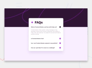
Design comparison

Solution retrospective
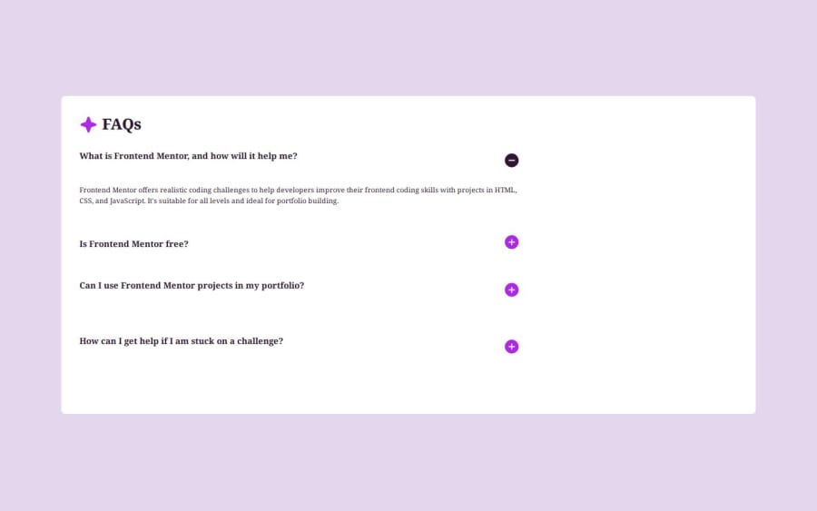
This is the first time I have designed a project using a mobile first approach. What I did was make my desktop width to the smallest width that it could go and design the mobile design. After completing the mobile design, it seemed that the desktop design naturally fell into place. I had only used to desktop accordian background svg I didn't think it was necessary to add the mobile svg background pic. I am not so good at working with responsive website. So I am practicing here.
What challenges did you encounter, and how did you overcome them?I am still not sure on when to use em, rem, and %.
It also seems like the desktop design naturally came into place. Is this how it is supposed to work?
What specific areas of your project would you like help with?Responsiveness suggestions and approaches to using width and margins and paddings and such
Community feedback
Please log in to post a comment
Log in with GitHub
Join our Discord community
Join thousands of Frontend Mentor community members taking the challenges, sharing resources, helping each other, and chatting about all things front-end!
Join our Discord