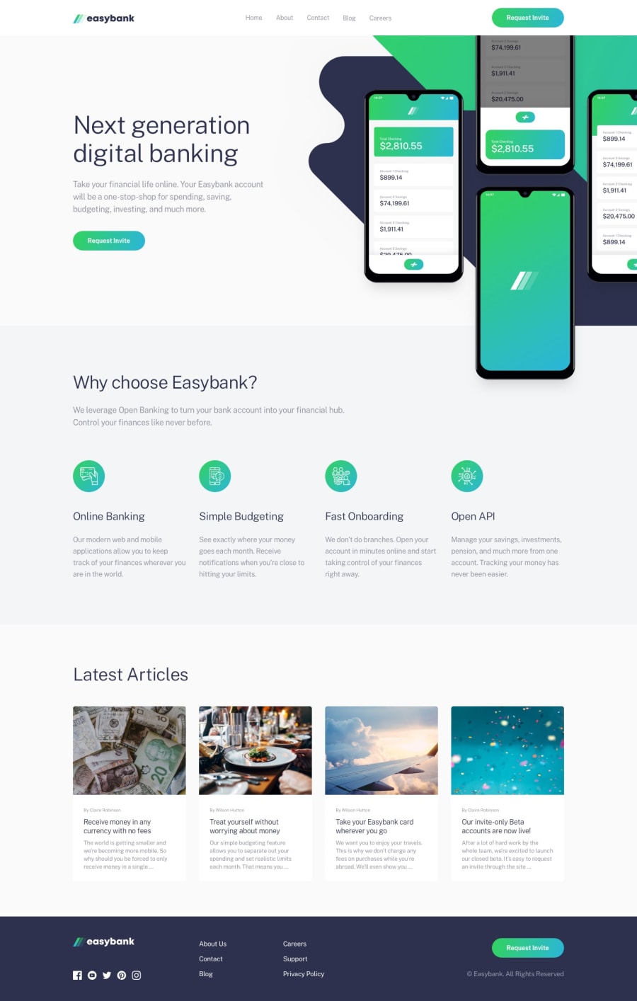
Design comparison
SolutionDesign
Solution retrospective
Couldn't make the image to hide when menu is open on mobile...
Community feedback
- @mattstuddertPosted over 4 years ago
Hey Norbert, nice work on this challenge. For the mobile navigation, I'd recommend using
position: fixedas opposed toposition: absolute;. You'd then be able to setheight: 100%so that the background takes up the full height of the screen and add a gradient to the whole background. That would resolve your issue.Let me know if you have any other questions 👍
0
Please log in to post a comment
Log in with GitHubJoin our Discord community
Join thousands of Frontend Mentor community members taking the challenges, sharing resources, helping each other, and chatting about all things front-end!
Join our Discord
