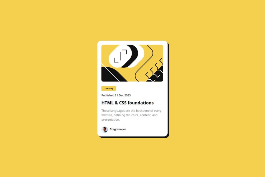
Design comparison
Solution retrospective
I am very proud to achieve almost perfect design by paying attention to all the details, both mobile and desktop.
What challenges did you encounter, and how did you overcome them?Finding the right sizes for the elements was the most challenging part, the Figma file was not helpful, so I did everything by measuring the initial design image with a ruler.
What specific areas of your project would you like help with?The correct sizes in Figma to achieve the same design
Community feedback
- @isushmoyPosted 12 months ago
Great work on the project! You've missed one thing though, the hover state for the shadow part. Perhaps you can look into that!
0
Please log in to post a comment
Log in with GitHubJoin our Discord community
Join thousands of Frontend Mentor community members taking the challenges, sharing resources, helping each other, and chatting about all things front-end!
Join our Discord
