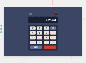
Design comparison
Solution retrospective
I'm most proud of successfully completing the calculator app challenge from Frontend Mentor, especially how I implemented the different themes and the responsive design, ensuring a smooth user experience across various devices. The logic for handling different calculations and edge cases also worked seamlessly, which was a significant achievement.
Next time, I would focus on optimizing the code further for better performance and perhaps add some more advanced features, like the ability to handle more complex mathematical operations or a history feature to keep track of previous calculations. Additionally, I would consider improving the user interface even more to make it visually appealing and intuitive.
What challenges did you encounter, and how did you overcome them?One of the main challenges I encountered was ensuring the accuracy of the calculations, especially when dealing with edge cases and various operator precedence. To overcome this, I thoroughly tested the app with a wide range of inputs and edge cases to identify any issues. I also reviewed and refined the calculation logic to handle these scenarios correctly.
Another challenge was implementing the different themes and ensuring that the design remained consistent and responsive across all devices. I overcame this by using CSS variables for theme management and media queries to adjust the layout for different screen sizes. Additionally, I made extensive use of browser developer tools to test and debug the UI on various devices.
Finally, ensuring the app was accessible and user-friendly was important. I addressed this by incorporating ARIA roles and ensuring keyboard navigation was smooth, enhancing the overall user experience for all users.
What specific areas of your project would you like help with?I would like help with the following specific areas of my project:
-
Code Optimization: Suggestions on how to optimize the JavaScript code for better performance, especially regarding calculation logic and handling state changes.
-
Advanced Features: Guidance on implementing more advanced features, such as a history of previous calculations or support for more complex mathematical functions.
-
UI/UX Enhancements: Feedback on improving the user interface and user experience, including visual design and intuitive interactions.
-
Testing: Advice on best practices for testing the application, including setting up automated tests for both unit and end-to-end testing to ensure reliability and robustness.
-
Error Handling: Improvements in error handling to gracefully manage invalid inputs or unexpected user actions without breaking the application.
-
Accessibility: Enhancing accessibility, including ensuring the app is fully navigable via keyboard, providing appropriate ARIA roles and labels, and improving color contrast for better readability.
Any insights or recommendations in these areas would be greatly appreciated to further enhance the quality, functionality, and accessibility of the calculator app.
Please log in to post a comment
Log in with GitHubCommunity feedback
- @AutumnsCode
Hi, well done!
The only thing I could say, if the result container also show plus, minus etc. so people know what they before.
Join our Discord community
Join thousands of Frontend Mentor community members taking the challenges, sharing resources, helping each other, and chatting about all things front-end!
Join our Discord
