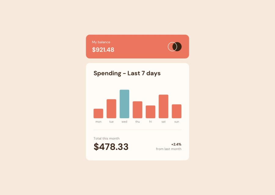
Design comparison
SolutionDesign
Solution retrospective
It's my first time doing some chart like that I tried my best to do as automatic as I could have done.
Any advice on how making it better or make it even more scalable an automatic?
Thanks
Community feedback
- @WandolePosted over 2 years ago
Hey, that's a pretty honest work that you've done! It's very not far from being very good!
The advices I could give you:
- try to stick more to the given design (for example: add a sparator between the chart and the
.content_summary, add a border radius for the graph bars, improve the font-size on some elements, etc.) - In the JS, you coded well the hover effect; but it would be better (and easier) to use
.bar:hoverpseudo-class in your CSS to style the component when the mouse is hovering on it! - From a general point of view, you should remove every styling from your JS (beside
heightthat is usefull in the challenge) and put it in you CSS (the background-color for example). In your JS, just add or removeclassfrom HTML elements.
I hope it will help you!
Marked as helpful0 - try to stick more to the given design (for example: add a sparator between the chart and the
Please log in to post a comment
Log in with GitHubJoin our Discord community
Join thousands of Frontend Mentor community members taking the challenges, sharing resources, helping each other, and chatting about all things front-end!
Join our Discord
