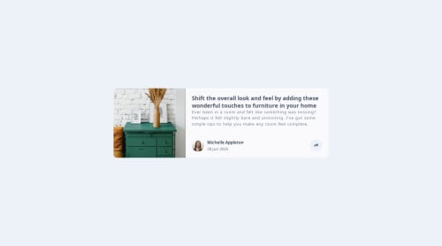
My Article Preview Component Solution
Design comparison
Solution retrospective
It was my first time using JavaScript for a project. I am happy that I was able to look up the information I needed and figure things by plug and play. I am getting used to getElementbyId
What challenges did you encounter, and how did you overcome them?The JavaScript requirements were slightly challenging, but I had a small obstacle with the responsiveness.
What specific areas of your project would you like help with?After, I thought I was completed. I realized I made a mistake with how the social media icons get displayed when at full screen. I need to go back and fix it later. I do not have the patience to do it now. Is it an easy fix?
Community feedback
- @grace-snowPosted about 1 month ago
I'm afraid this is non-functional for many people. It's inaccessible to keyboards and screen readers. And it breaks quite badly when I tap the share button on mobile (I'll add an image to discord so you can see).
To improve this
- fix the indentation so your code is readable. Your code editor can even do this formatting automatically for you with prettier.
- add / update all the missing interactive elements like the button and links.
- make sure of those elements have an accessible name provided by content inside or aria label. Note these names should communicate function not include words like "icon".
- I think you may have to reorder the html so the share popup content is within the same wrapping element as the button. I think that will be necessary to do the positioning as the share content needs to be positioned against that button on the larger screens.
- modernise and simplify the javascript. Use const not var. And don't mess with inline styles in javascript. Let javascript only handle interactivity, like toggling classes or attributes. It shouldn't be messing with styling, let CSS handle all the styles.
- font size must never be in px. I thought you'd had that feedback before actually. https://fedmentor.dev/posts/font-size-px/ explains more.
- it's better for performance to link fonts in the html head instead of css imports.
- this only needs one media query and should not have any
!important
. When you have to resort to that it's usually a sign there is a problem in your css. - the paragraph and container shouldn't have a width. The component should only have a max width in rem and optionally width 100%.
This is hard to read due to the indentation and the javascript mixing style responsibilities so it's hard to advise further (I am away from my computer so only able.to give the above feedback from reading the code).
Marked as helpful0@VincinChristmasPosted about 1 month agoI wasn't aware I was using px anywhere with font-size. Maybe I made that small mistake somewhere? I will go back and double check. Thanks for your helpful and straightforward feedback ! I will go back and look at this again. @grace-snow
0
Please log in to post a comment
Log in with GitHubJoin our Discord community
Join thousands of Frontend Mentor community members taking the challenges, sharing resources, helping each other, and chatting about all things front-end!
Join our Discord