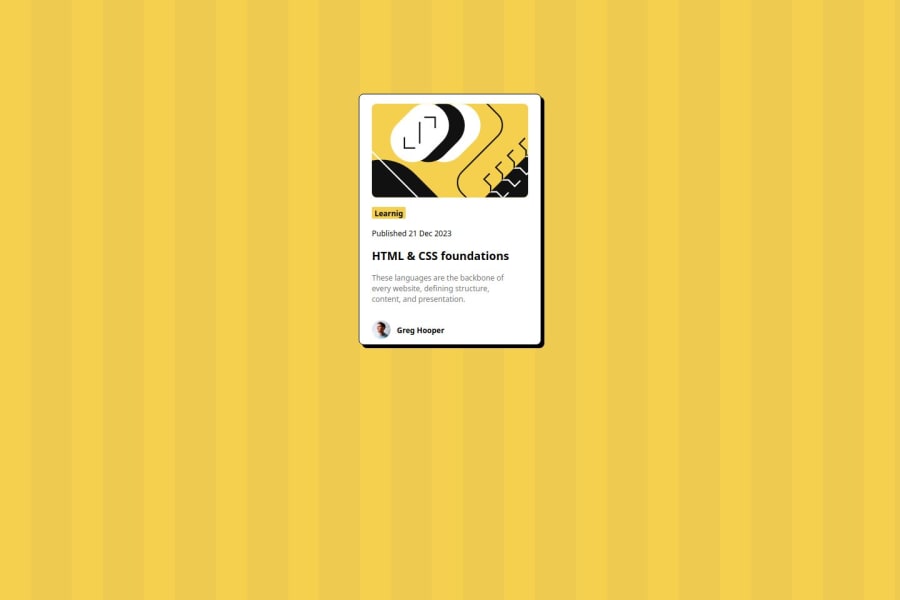
Design comparison
Solution retrospective
I experimented with HTML and CSS on my own and got it right.
What challenges did you encounter, and how did you overcome them?I experimented with flex and grid to get the results I wanted, and eventually I settled on flex.
What specific areas of your project would you like help with?I have insecurities about my coding. I'm not sure if it works or not.
Community feedback
- @StroudyPosted 2 months ago
Great stuff for your first project you should be proud, Some things to note,
- Missing a
<meta>
description tag for SEO purposes, - You should apply a full modern reset to make things easier as you build, check out this site for a Full modern reset
- Using a naming convention like BEM, Using proper naming will prepare you for the changes in design of the website.
- Using
max-width: 100%
ormin-width: 100%
is way more responsive then justwidth:100%
, check out this article also from the same Frontend mentor dev responsive-meaning, she goes into more detail. - You should avoid using
px
as it is an absolute unit and not a responsive unit likerem
orem
, You should look at this article from a Frontend mentor dev, Why font-size must NEVER be in pixels. - Another great resource for px to rem converter.
- You are missing a
alt=""
on your<img>
element, Having betteralt=""
descriptions for accessibility is a must check this out Write helpful Alt Text to describe images, - Setting a height and width attribute to your
<img>
will increase performance to reduce layout shifts and improve CLS, It reserves the space on the page for the image.
I hope you found some of this information helpful, You should give the articles a good read and I look forward to seeing some more from you, Happy coding! 💻
Marked as helpful0@mongkolkhanit-dPosted 2 months ago@Stroudy Thank you I will take your feedback to improve my work 😊
0 - Missing a
- @TedJenklerPosted 2 months ago
Hi @mongkolkhanit-d,
Nice project! I really love the animations—they look smooth, and the extra effort shows.
One thing I noticed is that you rely heavily on <div> elements. Remember, <div> should only be used when necessary. For this project, you only really need three <div> elements: one for the card, one for the footer, and one for the badge. The other elements can be more semantic, such as <time>, <h2>, and <p>, which will improve SEO and accessibility. Always try to avoid unnecessary <div>s, and use Flexbox to structure elements. For example, display: flex with flex-direction: column will stack all elements on top of each other nicely.
Keep up the great work!
Best, Teodor
0 - @ZahirHaniche-devPosted 2 months ago
I have a few comments on your code. Firstly, you should create a /src folder to have a more logical architecture. Secondly, create a /styles folder within /src and put your CSS file in it.
Congratulations on your project and keep up the good work! 😊
0@mongkolkhanit-dPosted 2 months ago@ZahirHaniche-dev Thank you for your comment 😊
0
Please log in to post a comment
Log in with GitHubJoin our Discord community
Join thousands of Frontend Mentor community members taking the challenges, sharing resources, helping each other, and chatting about all things front-end!
Join our Discord