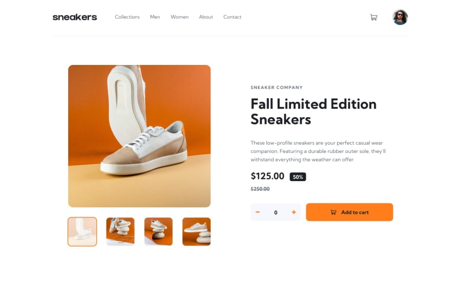
Design comparison
Solution retrospective
This is my first project where I implemented a mobile-first approach, and I would structure the menu’s HTML differently next time
What challenges did you encounter, and how did you overcome them?The minus and plus SVG buttons didn’t work correctly for me, so I had to switch to Font Awesome for another SVG. However, it wasn’t a challenge
What specific areas of your project would you like help with?I would appreciate it if you could take a look at my project and code, and share your feedback.
Community feedback
- @TheBeyonder616Posted 2 months ago
Congratulation on your code. it's really good, consider adding transition next time to make the website look smooth
Marked as helpful0@maziarjaPosted 2 months ago@TheBeyonder616 I appreciate your feedback. Next time, I’ll focus more on transitions. I’ve also added some transitions to the navigation and mobile menu following your comments.
0 - @MsadafKPosted 2 months ago
this looks great 👍
1
Please log in to post a comment
Log in with GitHubJoin our Discord community
Join thousands of Frontend Mentor community members taking the challenges, sharing resources, helping each other, and chatting about all things front-end!
Join our Discord
