Submitted about 3 years ago
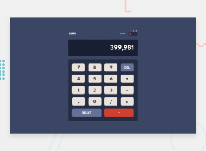
Multi-themed Calculator App using Vanilla JS and CSS Grid
@NdukeSam
Design comparison
SolutionDesign
Solution retrospective
I would feedback on the performance of the app. And also the implementation of the User Interface.
Community feedback
- @Dharmik48Posted about 3 years ago
Hey👋,
Your solution is pretty decent, here some suggestions:
- You should remove the yellow border and to center the calc, add
display: grid;andplace-items: center. - When the user types a very long number, it gets overflowed from the display, you should fix that.
- And when the user selects an operation(+,-,*,/) you should show the operation too on the screen.
Apart from these it is really nice, Keep it up🤗
Marked as helpful0@NdukeSamPosted almost 3 years ago@Dharmik48 Thank you so much!! I'd be sure to apply. Though I structured the app not to reflect the operators on screen.
0 - You should remove the yellow border and to center the calc, add
Please log in to post a comment
Log in with GitHubJoin our Discord community
Join thousands of Frontend Mentor community members taking the challenges, sharing resources, helping each other, and chatting about all things front-end!
Join our Discord
