Design comparison
SolutionDesign
Solution retrospective
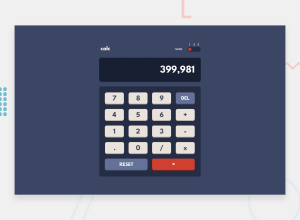
I could not figure out how to code the toggle switch for three radio buttons. Also, I keep failing at designing with Figma. If you have a solution, please share and any feedback is appreciated it's the way of learning.
Community feedback
Please log in to post a comment
Log in with GitHubJoin our Discord community
Join thousands of Frontend Mentor community members taking the challenges, sharing resources, helping each other, and chatting about all things front-end!
Join our Discord
