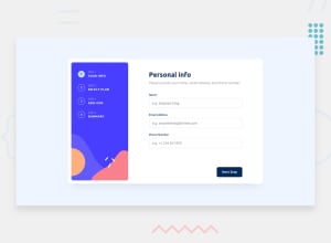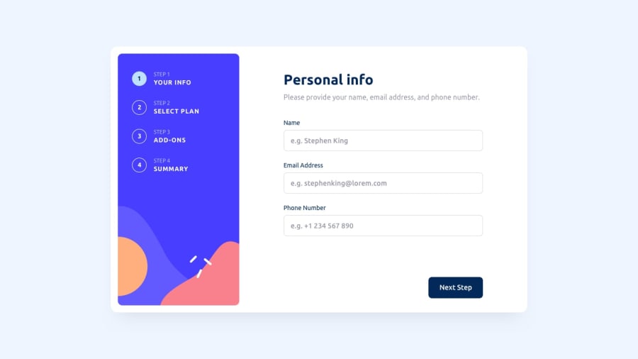
Design comparison
Solution retrospective
Hi, 👋 everyone, This is my solution for this multistage form. I would like to have some feedback if you don't mind. 🙏
I hade some through time compiling it with a combination of sass tailwindcss 😅
Community feedback
- @iElvisJosuePosted over 1 year ago
Hi bro! Nice job.
My feedback is the following: 1.- The 'go back' button should not be visible from the first step, 2.- The validation messages should apply even when the input is empty, 3.- The inputs are not validated correctly (Number for example can be a word, that's wrong), 4.- The plan step does not change the prices to Y or M when pressing the button.
👋
Marked as helpful1@wintercodeNKJJPosted over 1 year ago@iElvisJosue
Thank you 🙂, I will check it out
0@wintercodeNKJJPosted over 1 year ago@iElvisJosue I just did the required modifications 🙂👍
0
Please log in to post a comment
Log in with GitHubJoin our Discord community
Join thousands of Frontend Mentor community members taking the challenges, sharing resources, helping each other, and chatting about all things front-end!
Join our Discord
