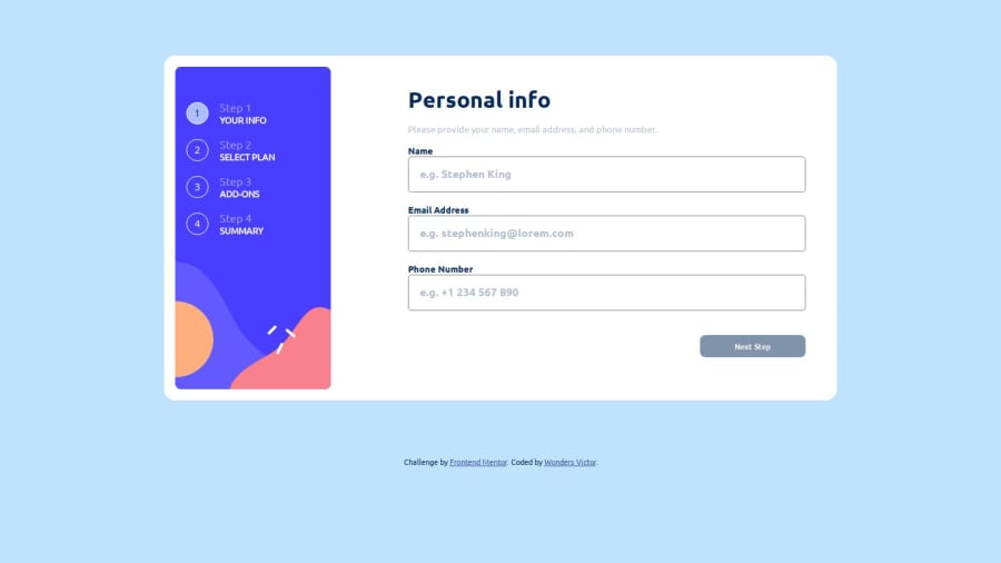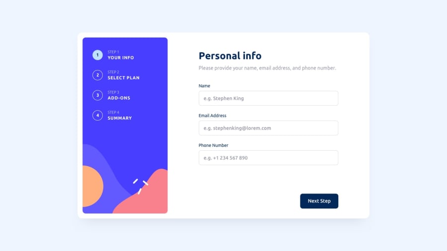
Design comparison
Solution retrospective
I'm proud of being able to better organize my code. I still have a lot to learn, though.
What challenges did you encounter, and how did you overcome them?Selecting certain elements in my JS and CSS was a bit tricky, but with more focus and carefulness, I was able to overcome it.
What specific areas of your project would you like help with?I'd like more understanding on the use of '+' and '~' in selecting elements in CSS.
Community feedback
- @grace-snowPosted 7 months ago
Hi, I'm afraid I see quite a few accessibility issues in this. I recommend you try using it with a screen reader to debug and run an automated scan at each step (eg using Axe devtools).
There is also an important usability problem because you've chosen to disable the next button (very bad for accessibility too). This means users must choose an add on in order to continue through the form.
The other problem I had was with some controls being hidden by the "next" bar at the bottom of the screen. I couldnt scroll down far enough to reach the toggle at all, for example.
The last thing I couldn't understand was why the steps numbers are buttons... If they're not interactive they mustn't be coded as interactive controls.
Marked as helpful0@WondahsPosted 7 months ago@grace-snow
Thank you for your observations. I'll work towards resolving them.
0
Please log in to post a comment
Log in with GitHubJoin our Discord community
Join thousands of Frontend Mentor community members taking the challenges, sharing resources, helping each other, and chatting about all things front-end!
Join our Discord
