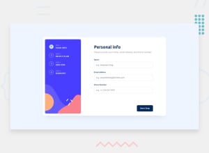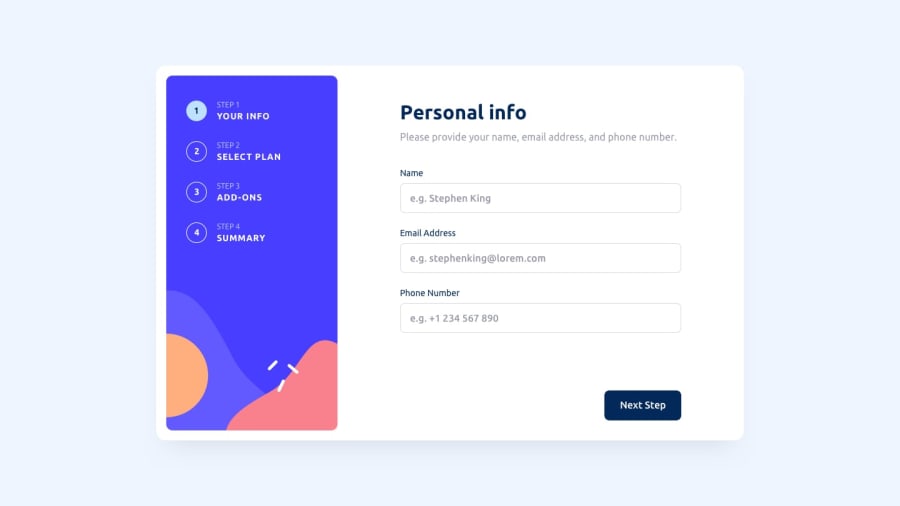
Design comparison
SolutionDesign
Solution retrospective
Feel free to share your opinions, any constructive feedback will be warmly received.
Community feedback
- @iamsomrajPosted over 1 year ago
Hi jeansy42,
Loved your implementation. Would suggest make the whole form visible within the viewport. Also, for the plan section, plan cards are increasing in height (UI Jumping) when Yearly is selected. Having a min height can fix it.
I have done the same challenge myself, too. Please suggest some improvements too.
Marked as helpful0
Please log in to post a comment
Log in with GitHubJoin our Discord community
Join thousands of Frontend Mentor community members taking the challenges, sharing resources, helping each other, and chatting about all things front-end!
Join our Discord
