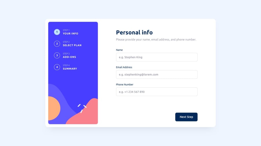
Multi-step form with only Mobile Layout implemented (tbc)
Design comparison
Solution retrospective
Currently, I have implemented the mobile layout only. It is recommended to view the site while open the chrome inspector mode with mobile view.
For the UI parts, I mainly used ReactJS for the UI flow control. To implement the logic of the multistep of the forms, I used Redux for state management to store the form data. By installing the redux addons on Chrome, you can view how I manipulate the redux state.
If I have time, I will complete the desktop layout later.
Feel free to leave any feedbacks. I would appreciate that.
Community feedback
- @JagholinPosted over 1 year ago
Some things I noticed:
-
error status is not cleared when the user corrects the wrong input, but only when they press the "next step" button. To fix, you can reevaluate error states in onChange events.
-
phone input doesnt [recognize '+'] or spaces. Also [minsize 10] is too large, phone numbers can be way shorter.
-
in
slices/formSlice.tsI would add checks that you are not doing out-of-bounds array access. -
your regexp for phone numbers is way too specific and doesnt allow much room for different formats, and only accepts 10 digits. Also it has an obvious error - to add spaces to a character range [], you have to add slash in front
\s. I recommend using a tool like regex101 to handle regular expressions. -
if you are using
<label>withhtmlFor, it needs anidof the element that the label refers to, not thename. See https://developer.mozilla.org/. -
Your checkboxes all have the same
idattribute. This is invalid - HTML elements should have unique ids, if any. You can use React'suseId()hook to generate unique IDs. -
On the second page your options dont have any real form elements, (and neither any ARIA attributes) which hurts accessibility. To fix, you can hide an
<input type="radio" >in there. This will also help with tab-navigation on this page(or if you want to bruteforce this part, you can set tabindex attribute. -
Using a translation file for strings is an interesting idea(and one I havent seen here before), but without any UI connected to it its completely invisible to the user. I assume this is something for the future versions of this project.
-
overall it's a good project and shows that you have knowledge about a lot of topics.
-
but I also have a feeling that it's way heavier and more complicated than it should be. Other side of a coin :)
Marked as helpful0 -
Please log in to post a comment
Log in with GitHubJoin our Discord community
Join thousands of Frontend Mentor community members taking the challenges, sharing resources, helping each other, and chatting about all things front-end!
Join our Discord
