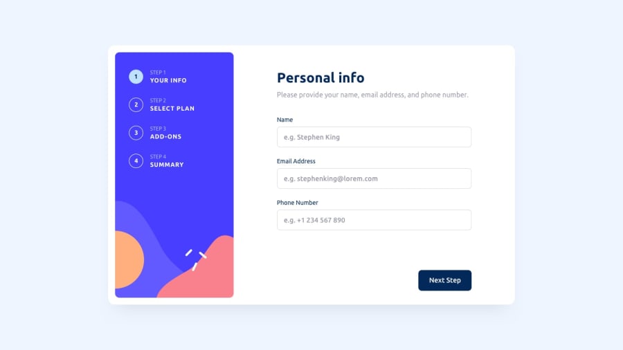
Design comparison
Solution retrospective
I tend to add some features to my solution, but for sure I ask for any suggestions that can increase the performance of the project.
Community feedback
- @AhmadYousif89Posted over 1 year ago
Hi Ibrahim 👋
I just wanna say that your solution was awesome you did a great job 👍
General thoughts
-
I like that you have done this challenge using vanilla Js, however I noticed that you render different html pages for each step (which is not entirely bad thing in this situation) but Imo a better practice and performance wise would be rendering the steps conditionally on the same page.
-
for better user experience you may use the top/side nav btns as actual nav btns that go to certain step on click, as for now they're just decorative looking btns .
-
consider adjusting the css for the mobile devices as for now the user need to scroll up and down just to see the bottom nav btns
-
consider making the change btn in the last step to actually changing the billing cycle as this is the correct behavior for the change btn.
after all awesome job man and happy coding 👍
Marked as helpful0 -
Please log in to post a comment
Log in with GitHubJoin our Discord community
Join thousands of Frontend Mentor community members taking the challenges, sharing resources, helping each other, and chatting about all things front-end!
Join our Discord
