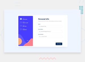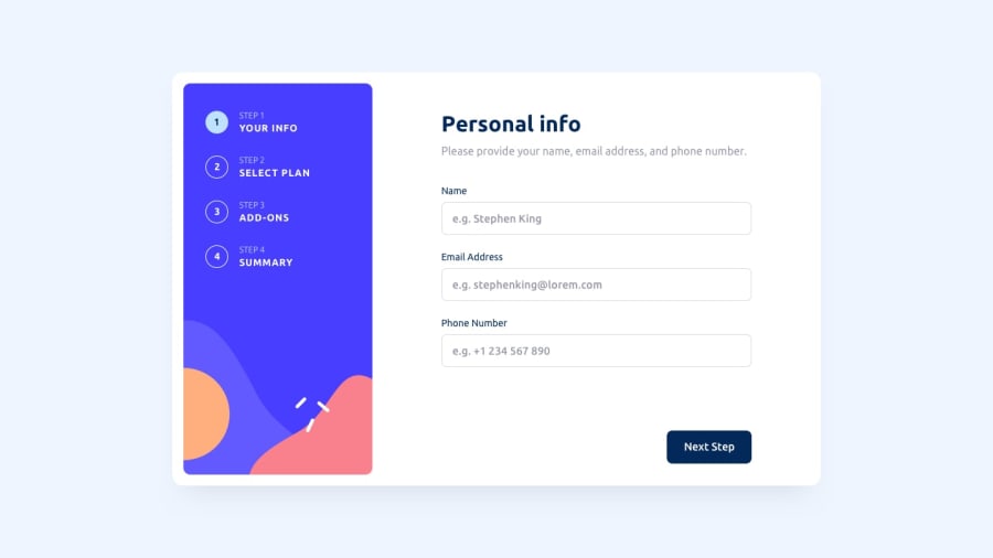
Multi-step Form using React, Tailwind, Typescript, Redux Toolkit
Design comparison
Solution retrospective
🎉 Hello all! I just completed this challenge.
I must admit, while I'm proud of what I've achieved, but I understand that there's always room for improvement. If you have any suggestions or changes in mind, I would greatly appreciate your input. It will definitely help me in my learning journey.
Thank you all for being such a supportive community. I'm looking forward to hearing your feedback and continuing to enhance my skills. Let's keep pushing forward together! 💪🌟
Community feedback
- @jeansy42Posted over 1 year ago
Hi brother Somraj Mukherjee, thank you for your feedback, I really appreciate it. I've looked at your project and I respect your work, but I believe there are areas where you can improve.
I think you shouldn't proceed to the next step if the current one hasn't been properly validated. Even though you disable the next button, we can still skip the current step using the sidebar, bypassing the validations. However, at the end, the form is not allowed to submit unless everything is correct.
There is a small error in the pricing of the annual plans compared to the original design, and you're not including the promotion of two months free (which is why the height of my plan cards increases when switching from monthly to annual).
Other than that, I think it's a great job, my friend, and I congratulate you. You probably have more experience than me, and you have motivated me to learn other technologies that I haven't mastered yet, like TypeScript and Redux. Take my recommendations with care, and let's keep growing together!
Marked as helpful1@iamsomrajPosted over 1 year ago@jeansy42
Hi Jeansy! Thank you so much for taking the time to provide me with your feedback. I truly appreciate it. I apologize for missing the inclusion of the two months free promotion in the Plan Card, but I have rectified that now. Your attention to detail is impressive!
Regarding the navigation, I intentionally kept the sidebar open to provide users with more flexibility. It allows them to have an overview of the entire process and makes it easier for them to navigate between steps. However, I understand your point about potential validation issues. It's always good to explore different approaches and see what works best for the users.
I'm thrilled to hear that my work has motivated you to learn new technologies like TypeScript and Redux. They are definitely worth exploring, and I'm sure you'll find them valuable in your own projects. If you ever need any assistance or have further suggestions, feel free to reach out. Let's continue growing together!
0
Please log in to post a comment
Log in with GitHubJoin our Discord community
Join thousands of Frontend Mentor community members taking the challenges, sharing resources, helping each other, and chatting about all things front-end!
Join our Discord
