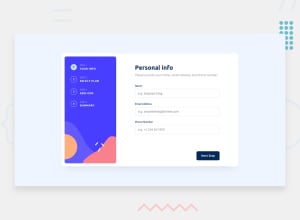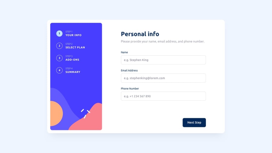
Design comparison
Solution retrospective
Hello community members,
I just finished my first challenge - multi-step form. Please help review, any feedback is greatly appreciated ! :)
I had some difficulty making the site responsive. I started with desktop design and then added the mobile design using media queries but had to do a lot of changes to the css file to make both work well. Looked up some best practices, and the mobile first approach is recommended, so I will focus on it for future development.
Question for community, what is is best way to decide on breakpoints for different screens? For this project I chose only two mobile and desktop but feel like this project needs a tablet screen breakpoint as well. Any suggestions/or recommended best practices for choosing breakpoints?
Thanks, snhase
Community feedback
- @DruxAMBPosted about 1 year ago
It will be preferable and much more easier if you use CSS frame works for your project e.g Bootstrapcss, Tailwindcss or Material UI.
Just read their documentations and you're all good to go.
You won't have problem with breakpoints using this frameworks.
I hope this was helpful ?
DruxAMB
Marked as helpful0@snhasePosted about 1 year ago@DruxAMB Thanks for your response. I wanted to challenge myself to just use CSS to make the project responsive. I was wondering if there was a good better way do in in just plain CSS other than media queries. Sure I agree, its just easier to use some CSS frameworks do it more smoothly.
1@DruxAMBPosted about 1 year ago@snhase, great and thanks for clarifying that.
Happy Coding
0
Please log in to post a comment
Log in with GitHubJoin our Discord community
Join thousands of Frontend Mentor community members taking the challenges, sharing resources, helping each other, and chatting about all things front-end!
Join our Discord
