Design comparison
Solution retrospective
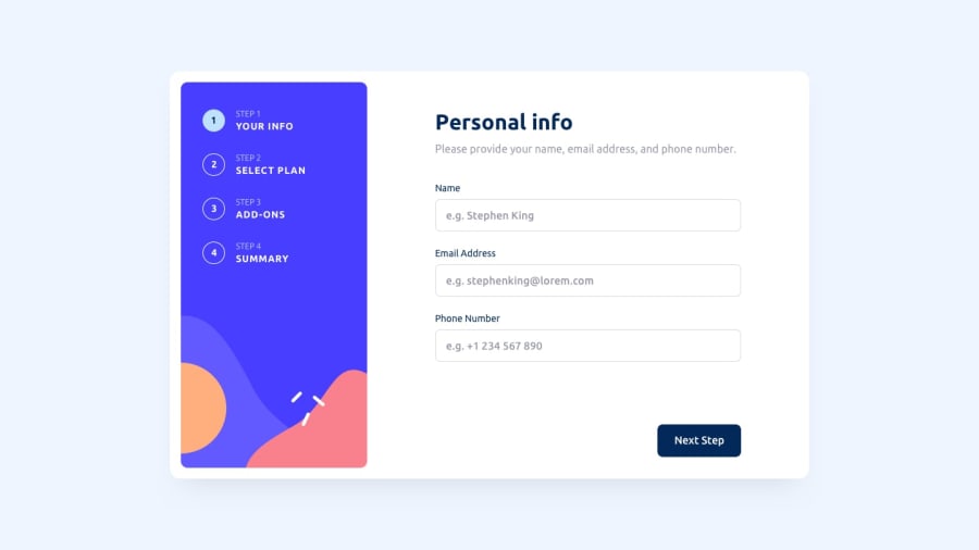
My solution for this project. Any suggestions will be appreciated.
Community feedback
- @Davidcharlie381Posted almost 2 years ago
Hi, Gideon. This is an awesome solution.
However, a few suggestions:
For the number field in step 1, for accessibility reasons,
input type='tel'would have been perfect. As it is now, when I click on the down arrow button, I can reduce down to -100. That's kinda like not nice.Also, the buttons are not quite responsive on mobiles.
For the step three bug issue, you could use a
:focus-withinpseudo class for the parent containers.I love the solution. The animations and all!
Marked as helpful1@wuzgood98Posted almost 2 years ago@Davidcharlie381 Thanks for your suggestions. I'll fix that.
0 - @WandolePosted almost 2 years ago
Hey!
Overall it's quite good!
As Peter said, there is a bug in Step 3. And I will add an other problem with your form validation (Step 1):
- the 'name' field is good!
- the 'email' field is valid even if I write something without '@' into it.
- the 'phone' field: the placeholder is '+1 234 567 890' but I can't write that into the field since it have the type 'number'
For those 2 problems, you could use an input:text and make the validation with RegEx for example!
I hope it will be usefull !
Have a good day :-)
Marked as helpful1 - @peterramirez18Posted almost 2 years ago
Nice work Gideon!
- Check the STEP 3, there's a bug when I click on the check/checked
Marked as helpful1@wuzgood98Posted almost 2 years ago@peterramirez18 yes, I just noticed it. Thanks for pointing it out. I'll fix it.
0
Please log in to post a comment
Log in with GitHubJoin our Discord community
Join thousands of Frontend Mentor community members taking the challenges, sharing resources, helping each other, and chatting about all things front-end!
Join our Discord
