Design comparison
SolutionDesign
Solution retrospective
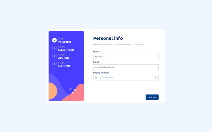
Hi there, the form validation and also mobile responsiveness parts were somehow difficult. I spent on them several hours. Overall, the project is very interesting. Any feedbacks and suggestions will be appreciated. Thanks.
Community feedback
- @RubenSmnPosted almost 2 years ago
Hi Diyar, nice work on this multi step form. I really like the feedback you get when selecting a plan and addon, the blue looks good.
I did find some minor things you could improve on with the UI/UX
- focus state on the input labels
- interaction on the Next Step and Go Back button
0
Please log in to post a comment
Log in with GitHubJoin our Discord community
Join thousands of Frontend Mentor community members taking the challenges, sharing resources, helping each other, and chatting about all things front-end!
Join our Discord
