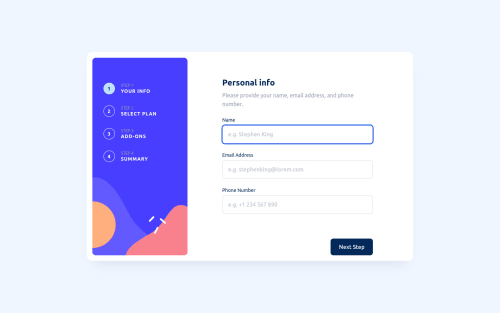
Multi-step form using multiple tab sections and js to hide/unhide

Solution retrospective
This challenge is deceptive. It looks a lot simpler than it is. On reflection, this challenge requires javascript form management, dynamic creation of div content with js, custom styled components for text input, checkbox and radio button. The step list is also somewhat involved and layout is tricky due to some choices by the designer.
I tried to make this as accessible as possible. Keyboard navigation is fully enabled and focus is set on the first interactive element on each tab as the next button is pressed.
The toggle switch for monthly / yearly is a little awkward for screen reader as it's difficult to convey what the text on the left and right means. I chose to add an aria-label to one of them to provide a more meaningful description.
Please log in to post a comment
Log in with GitHubCommunity feedback
No feedback yet. Be the first to give feedback on J Cooper's solution.
Join our Discord community
Join thousands of Frontend Mentor community members taking the challenges, sharing resources, helping each other, and chatting about all things front-end!
Join our Discord